There it was — Season 2, Episode 7 of the harrowingly superb series “The Last of Us.”
(Don’t worry, no spoilers.)
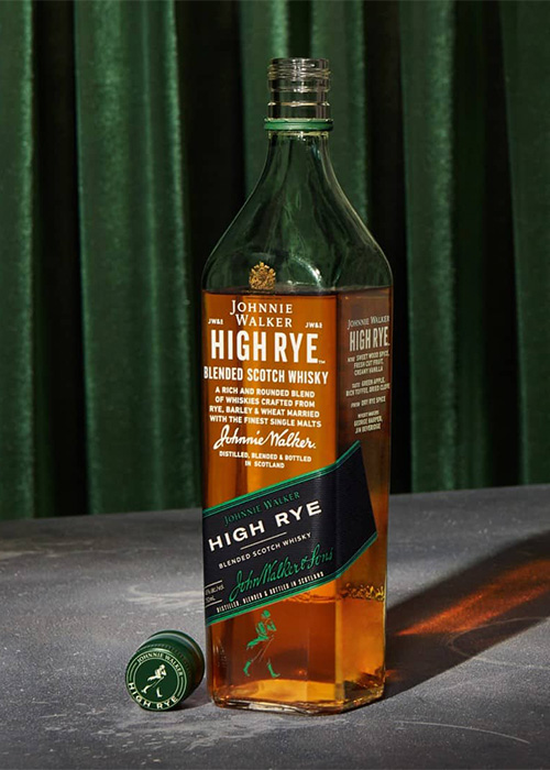
As the character played by the brilliant Jeffrey Wright talks with a compatriot, a tall, rectangular bottle sits in soft focus behind him. Though the color palette is justifiably subdued for the moody scene, and the packaging’s letters too blurry to properly make out, it’s impossible to miss: that blue label.
Still not catching on? How about this color-coded lineup: the workhorse red, the bold black, the beguiling green, the prestigious gold, and at the top, the coveted blue.
It’s possibly the ultimate example of color coding done right in the spirits world. Those diagonal labels on tall, rectangular bottles are magnetic in their appeal. Johnnie Walker Scotch whisky has become synonymous with that chromatic progression. The design is so successful, and so woven into consumer psyche and drinks lore, that whisky enthusiasts will personally identify themselves with their color of choice. (I’m a green guy, for the record.)
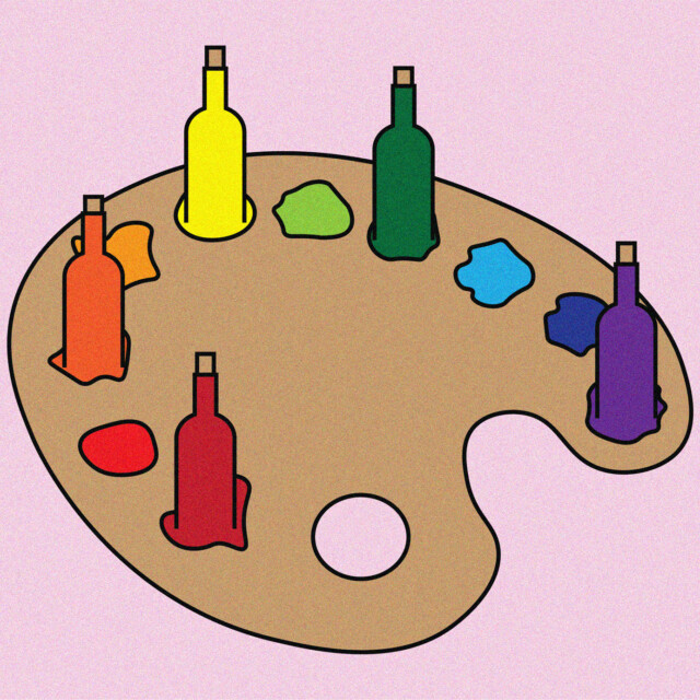
Yet in the wine industry, few brands have embraced a similar strategy. Despite endless SKUs and fierce shelf competition, color-coded labeling remains an untapped design tool. Why haven’t more wineries taken advantage? A dive into brand design psychology — and a look at a few outliers that have — helps reveal what’s behind the missed opportunity.
The Consumer Label Journey
Whether worked into label patterns, emphasized through font schemes, or in the form of an image or photo, color worms its way into our subconscious and shapes how we perceive a product.
“[Color] can help consumers navigate complex portfolios and busy categories. Simplicity is the key, while also understanding if there are any category color norms,” says Hamish Campbell, VP executive creative director at award-winning international drinks design agency Denomination. “Consumers look for and see color along with shape first. So when it comes to a very large and busy shelf, these fast signifiers become very powerful for brands.”
He walks through the initial consumer journey from first glance to back-label investigation — a four-stage process based on distance.
“[It’s] a visual shortcut [and] intuitively communicates information at a glance. The goal is to reduce the cognitive load for customers.”
“First at 10 feet, you want a strong brand presence, which should have a consistent approach to color or design. This will enable a strong shelf block and stand out, making sure the consumer finds you over the competitors,” he says. “Next at five feet, a secondary level comes into play: You want to help navigate a specific product type or flavor. Following that, at three feet could be product benefit or ingredients. And one foot — in the hand — can build unique storytelling.”
When it comes to product association with color, the most ambitious concept is absolute brand ownership of a hue. It’s not an easy trick to pull off, but for those that manage it, a singular color becomes a timeless calling card.
When Brands Own a Color
It’s a masterstroke of marketing artistry — the classy enticement of Tiffany Blue, the visceral thrill of Ferrari Red.
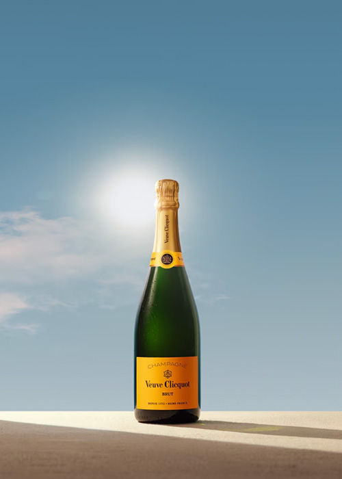
It certainly exists in the wine industry — though rarely — but the branding role model every Champagne drinker knows is of a distinctly yellow shade. “It’s hard to ignore the power of Veuve Clicquot,” Campbell says. “It’s instantly recognizable and reflects their luxury position.”

Using a signature as part of a two-tone combo is a far more common strategy for brand identity. That red background with the golden arches? The visual alone sparks a childlike jonesing for fries. Wash that down with something ice-cold in a scarlet can, accented by white cursive lettering. Not a single color, maybe, but there’s no mistaking what those products are. The branding is so deeply embedded in the culture, it feels like it was inceptioned into our brains at birth by the craftiest of Mad Men.
When it comes to intra-brand color design, bold color coding — the delineation of different products within a brand’s portfolio via assertive color signals, à la Johnnie Walker — is a widely used strategy across consumer goods. In the drinks world, no company has retro-styled and supercharged that concept quite like LaCroix.
“They used color strategically and playfully, and completely transformed what was a pretty sleepy category,” says Leia Reedijk, senior designer for Edition Design, a multidisciplinary outfit based in San Francisco and Portland. “Before LaCroix, sparkling water meant Perrier or San Pellegrino. They turned it into a lifestyle product — dare I say a cultural phenomenon. Now there are dozens of sparkling water brands, and nearly every single one uses color.”

This approach weaves together multiple advantages: easy recognition, emotional color bonding, and a “brand-wall” effect that helps the lineup pop on shelves. “[It’s] a visual shortcut [and] intuitively communicates information at a glance,” she says. “The goal is to reduce the cognitive load for customers.”
But with wine brands, color coding remains surprisingly uncommon — outside the obviousness of the RTD space — with only a few legendary supermarket examples bucking the trend. Yellow Tail magnums and Barefoot endcaps adorn tens of thousands of grocery wine aisles across the U.S., a testament to the strategy’s ample advantages and potential returns.
The two mega-brands pair their varietal offerings with a specified label color and capsule — e.g., Barefoot’s Merlot is blue and Malbec is green; Yellow Tail’s Shiraz is yellow and Cabernet red. The Barefoot approach modifies the hue of labels entirely, while Yellow Tail only adjusts the color of a varietal label band. Other than the color changes (and Burgundy-style bottle shape for the Pinot Noir and Chardonnay), the label and bottle designs within each respective brand’s flagship lineup are identical.
The result is unmistakable brand identity and instant product recognition.
No doubt it can work wonders if properly executed. So in a category suffering through tumultuous times and clamoring for answers, where is everyone else?
Color-Coded Wine Labels Lag
For brands like Barefoot and Yellow Tail, color coding isn’t just a visual flourish, it’s ingrained into the DNA. “[It’s] a core part of their architecture,” Reedijk says. “That’s why it works. It’s not decorative, it’s structural.”
Yet other mass-market brands eyeing the strategy might feel some hesitation, stemming from not wanting to come across as wanna-be pretenders. “How do you do it in a way that feels intentional and not derivative?” Reedijk adds. It’s a fair question — and no small hurdle — given how entrenched Yellow Tail and Barefoot have become. Their ubiquity turns them into instant comparison points, something challenger brands would almost certainly want to avoid. Considering the strategy’s undeniable power, it’s the most plausible reason behind the dearth of color coding on the value end.
Higher up in the super-premium and luxury wine segments, the motivation behind color coding’s overall absence appears more complicated. A few examples do exist — like California standouts Odonata Wine and Dragonette Cellars — and their commitment to the concept has become part and parcel of their successful brand identities.
“People love the colors. We’ve been consistent over 20 years with them, so Petite Sirah is still green 20 years later,” says Denis Hoey, owner and winemaker at Odonata in Monterey County. “[They] make it easy to have the conversation with clients. When they don’t remember a varietal, we ask what color.”
Brandon Sparks-Gillis, co-owner at Santa Barbara’s Dragonette, has seen similar results. Unlike Odonata’s bolder and more intentional approach, color coding wasn’t in the playbook from the outset. But as the brand evolved, it ended up working well. “We started out with white labels, and then used color to differentiate our wines as our lineup expanded,” he says. “Our intent has always been to create quality in the bottle, which we feel is more important than what’s on the bottle. But over the years, the various colors have made it easier for our customers to recognize what’s in the shipment or in their cellars.”
“There is a fine line between using color in a classic way, such as what Johnnie Walker has achieved, and using color in such an obvious way that seems cheap. Finding that balance is key in wine.”
More recently, Blandy’s Madeira underwent a sleek cosmetic overhaul courtesy of Volta Studio — though the trick may be easier to pull off given the fortified wine’s distinctive color and hybrid status between wine and spirits. The clear-glass, color-coded glow-up now offers easy identification and appeal across the 10-year range. “[It’s] leaning even harder into premium whiskey language,” Campbell at Denomination says. “The celebration of the liquid color, the premium foils, label architecture, and the highlighting of 10 years — and the more luxurious hue of color — all speak to quality.”
There’s the first fly in the ointment: “luxurious hue.”
The tipping point from brilliant to banal is razor thin when color coding any bev-alc product in the upper tiers of the market — especially for wine, with its class and tradition baggage. For unfortified table wines, it’s a high-risk maneuver. “There is a fine line between using color in a classic way, such as what Johnnie Walker has achieved, and using color in such an obvious way that seems cheap,” Sparks-Gillis says. “Finding that balance is key in wine.”
Reedijk at Edition adds that premium design and its use of color need to feel intentional. Otherwise, it risks coming across as trendy and juvenile instead of high-end. “It’s about restraint, quality cues, texture, weight, foil,” she says.
The second bug in the balm? Wine retailers themselves.
“In a boutique wine shop … color coding might not carry the same weight,” Reedijk says. Sure, the lineup and its color-wall effect look great on a producer’s website or in the tasting room, but retail shelves are almost always divided by country, varietal makeup, or style — all of which undermines a producer’s visual cohesion in the wild.
And so, the risk-reward algebra behind color coding seems to give super-premium-and-up table wine producers pause.
But fortune favors the bold — and those willing to hazard the dicey maneuver, and pulling it off, might just emerge from the current wine industry wreckage striding confidently alongside Johnnie.
This story is a part of VP Pro, our free platform and newsletter for drinks industry professionals, covering wine, beer, liquor, and beyond. Sign up for VP Pro now!
