Johnnie Walker’s Striding Man logo is perhaps as iconic as the Scotch itself. But if you’ve ever spent a long evening in the company of one of these bottles and the amber liquid they contain, you may have at one point during the night wondered how exactly this purposeful, flamboyant individual came to emboss your liquor bottle. We certainly wondered, and a recent visit to the Johnnie Walker archives in Menstrie, Scotland provided the answer. With the help of Christine McCafferty, the brand’s archivist, we’ve traced the historical path that the Striding Man has walked.
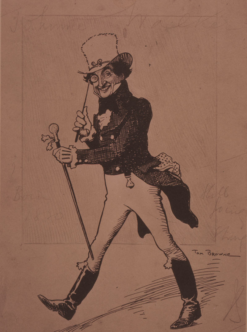
Back around the turn of the century, when George Paterson and Alexander Walker launched Red Label and Black Label — then called Special Old Highland Whisky and Extra Special Old Highland Whisky — they wanted to convey the brand’s unique point of view visually. They held a competition for suitable artwork but nothing quite fit the bill. It was a cartoonist named Tom Browne who eventually came up with the logo. During a lunch with Lord Stevenson, one of Walker’s directors, Browne turned over a menu card and drew the now famous Striding Man figure on the back.
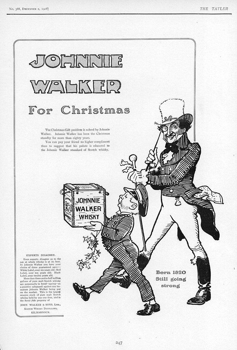
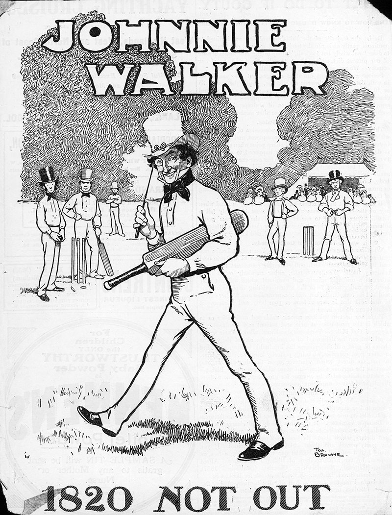
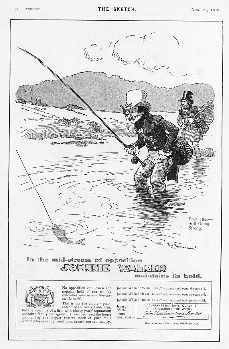
Browne’s Early Ads: 1908 – 1910
After that delightful lunch, Browne produced a series of Walker advertisements. Browne’s Striding Man was an outdoorsman who also enjoyed a spot of shopping. As you can see, the ads featured the Striding Man in a number of charming scenarios — happily striding behind a youthful courier, winsomely interrupting a cricket match, and rather briskly catching a fish.
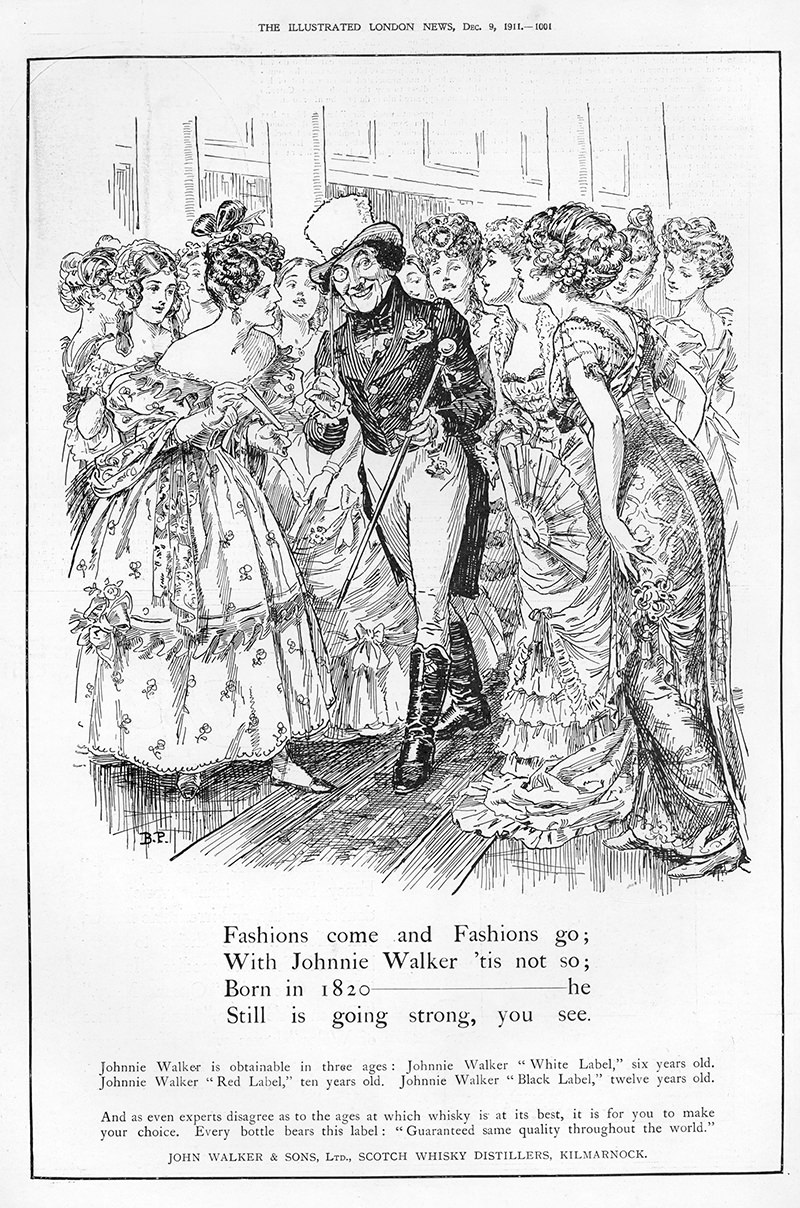
The ‘Fashions’ Series By Sir Bernard Partridge: 1910s
Browne died in 1910 — rather tragically, actually, at the tender age of 39, after a surgery for cancer. He was replaced by Sir Bernard Partridge, the main cartoonist for Punch magazine from 1909 to 1945. Partridge drew the figure for four years, and in those four years, the Striding Man developed a taste for fashion, city life, and women. No longer bringing gifts and fishing, Partridge’s Striding Man put on a bit of weight and found himself at the center of a flock of elegant, if besotted ladies. “Fashions come and fashions go,” read the copy. “With Johnnie Walker, ’tis not so.”
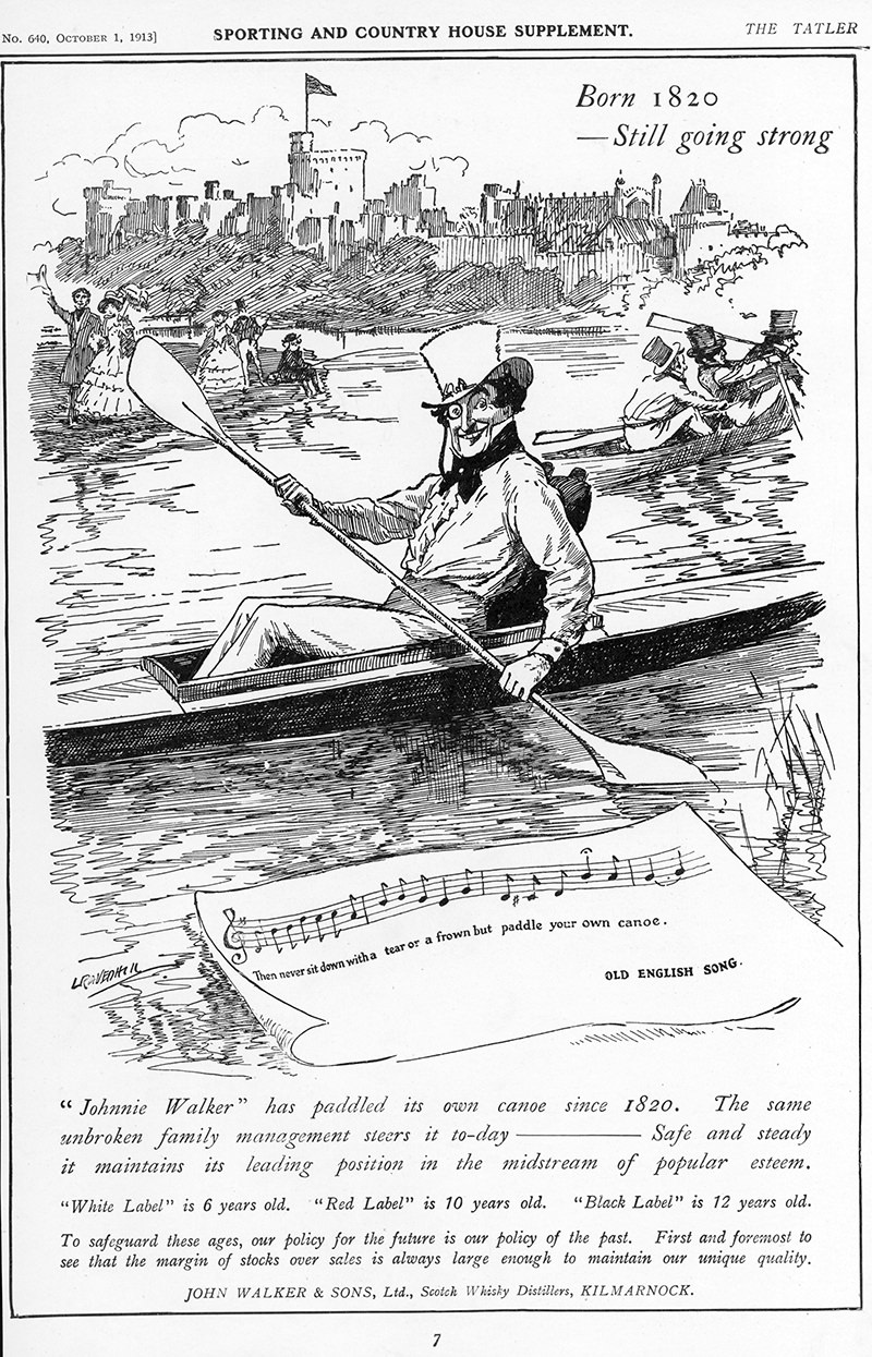
The ‘Old Songs’ Series By Leonard Ravel Hill: 1912
Next to take on the challenge was Leonard Ravel Hill, whose Striding Man enjoyed the sporting life.
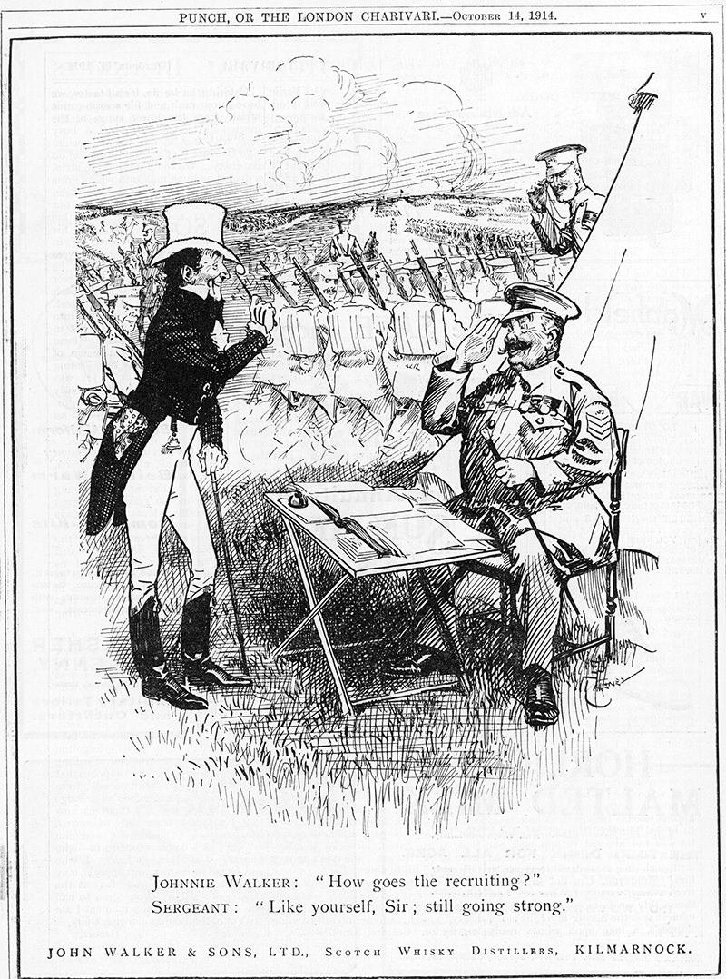
Leo Cheney’s Patriotic Ads: 1914 – 1918 (WWI)
Leo Cheney drew the Striding Man during the war, and did not hesitate to draw comparisons between the liquor and the brave soldiers fighting for British freedom.
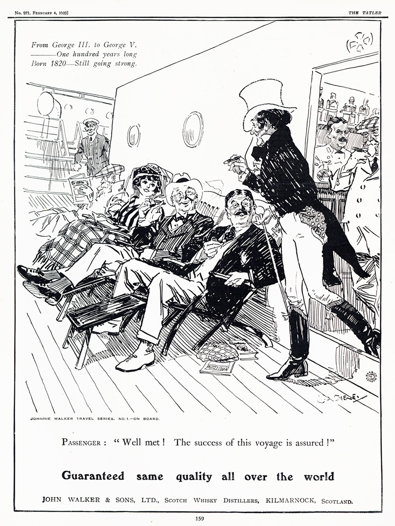
Leo Cheney’s ‘Travel Series’: Early 1920s
With the war over, the brand returned to the concept of Johnnie Walker as a universal, global brand with the “Travel Series.”
Doris Zinkeisen’s Modern, Colorful Ads: 1927 – 1928
Between 1927 and 1928, the Striding Man went through his first transformation at the hands of a woman — Doris Zinkeisen, a Scottish stage and costume designer, painter, commercial artist, and writer. Zinkeisen’s Striking Man was slim and, for the first time, dressed in red. He also had a wry sense of humor, suggesting a possible attempt to appeal to women. It’s safe to say that bringing in a woman cartoonist represented a rubicon for our Striding Man, not just into color, but into a new persona.
The ‘Quiz’ Series: 1928
Next followed a short series of “Quiz” ads. The Striding Man had been replaced by different parts of his attire.
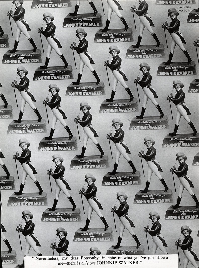
The Striding Man As a Logo: 1932
The 1930s saw a shift away from drawings into photos. Striding Statuettes were featured in 1932, followed by a series in which the Striding Man featured only as a logo.
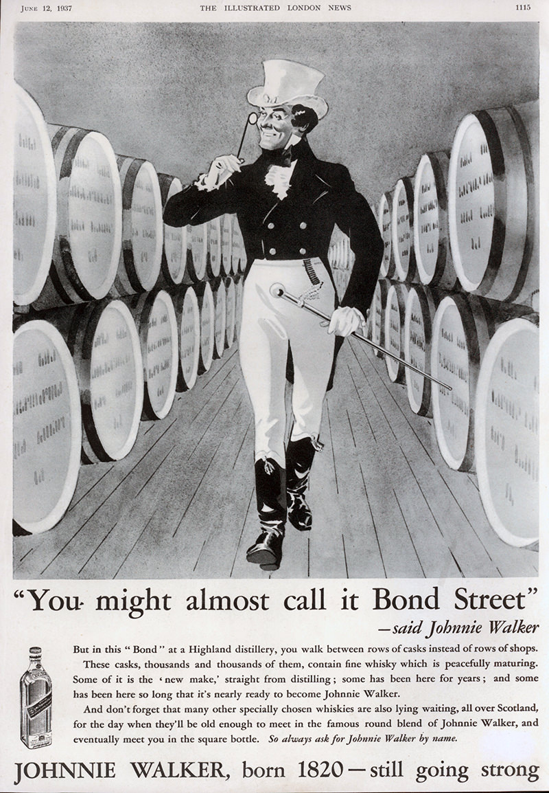
The Striding Man Himself Is Restored: 1936 – 1938
Between 1936 and 1938, the Striding Man was restored. But he was no longer simply a purchaser of Johnnie Walker. He was a veritable font of information, conveying tidbits of knowledge about the distilling process to would-be consumers, striding all the while betwixt barrels of whisky.
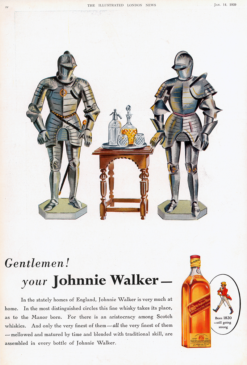
Clive Upton’s Early Ads Feature The Striding Man As a Logo: 1939 – 1950
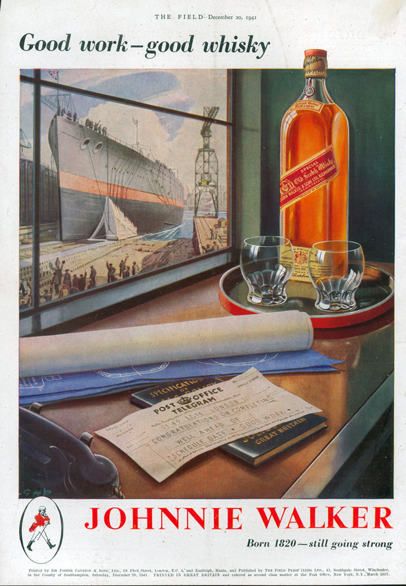
The next chapter in the life of the Striding Man reduced him significantly from his full-size self into a logo, though at least he is in color.
Upton’s ‘Time Marches On’ Series Debuted After WWII
The Striding Man figure stayed just a logo throughout WWII. He only made one appearance, in the drawing office of the GLC in an ad celebrating postwar reconstruction. But Upton’s next campaign, “Time Marches On,” put the Striding Man back at the center of the ad, a bridge between the past and present, and glad to be looking forward to the future.
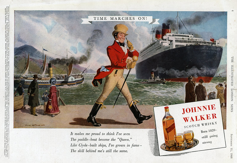
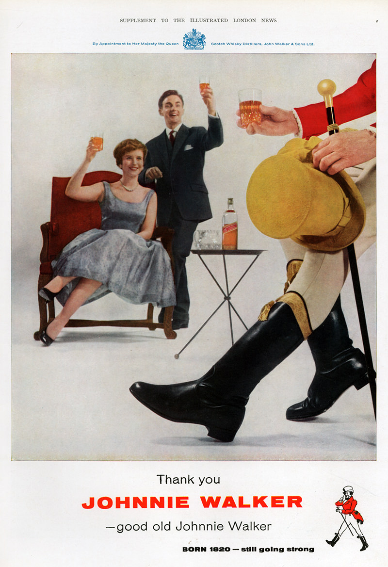
Photo-Driven Ads Come to the Forefront: 1959 – 1980s
But this brings us to ’50s, when photos started to dominate ads, replacing the cartoons of yesteryear. Take, for example, this delightful ad, in which the Striding Man is for the first time no longer striding but seated, his beautiful boots in the foreground, a young couple with a taste for Scotch eagerly toasting his health.
John Geary’s Update to the Striding Man: 1996 – 2015
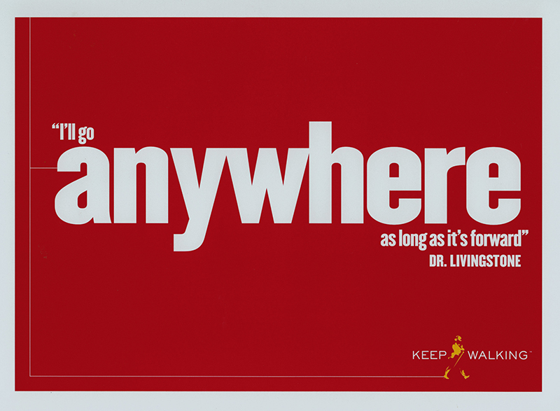
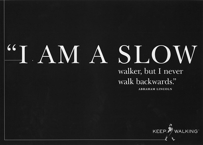
This brings us to the famous “Keep Walking” campaign. The campaign was created by BBH 3 in 1999, and it was designed to take Johnnie Walker back to its roots but also forward into the new millennium. The figure that appears in the campaign was created three years earlier, though, by John Geary for Michael Peters. It’s here that the Striding Man achieved his current delicate assertiveness, a nod to the charm, elegance, and charisma of the dandy.
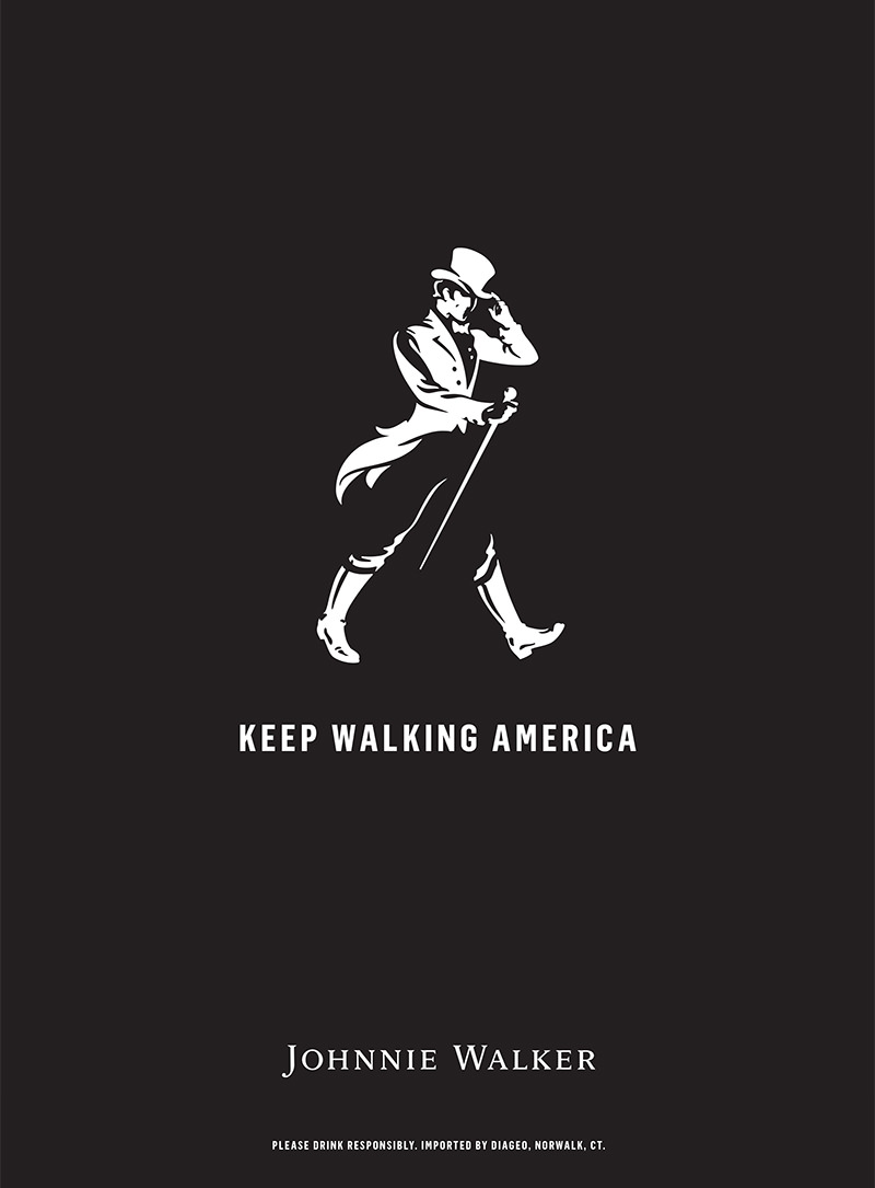
The Current Striding Man, Designed by Gary Redford for Bloom: 2015 —
There was one final redesign in 2015, which is the version we have now. Today’s Striding Man got his smile back, as well as a hat tip, and boots that presumably zip up the inside of the leg, rather than the outside (thank God!). His shirt and jacket got buttons, and his coattails got longer. The Striding Man in this latest incarnation went from Dandy to Mr. Darcy, eschewing the delicacy of yore for a more playful, countryside manner.