Heineken, the proudly Netherlands-based international beer brand, has been brewed for over 150 years. But despite the brand’s longstanding popularity — it is continuously cited as one of the most popular beers in the world — Heineken has made sure to keep things fresh in the brewhouse and on the bottle, often changing its logo to keep up with the times.
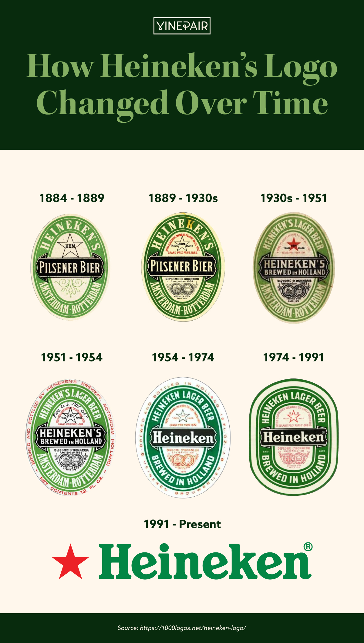
Like many legacy beer brands, Heineken’s logo has gone through a few different phases. The brand kept its signature oval-shaped design for over 100 years starting in 1884, until it simplified to its more minimalistic, modern typography-only look in 1991. Green has been the primary color of all of Heineken’s logos except for a brief stint in the 1930s through 1950s, when the brand introduced a red and white logo.
In addition, all of Heineken’s logos before 1991 include the brand’s hometown of Rotterdam, Holland — though many fans still mistakenly believe that the brand is based in Germany.
See Heineken’s logo evolution over time in VinePair’s infographic below.
![The Logo Evolution of Heineken Over Time [Infographic] The Logo Evolution of Heineken Over Time [Infographic]](https://vinepair.com/wp-content/uploads/2021/01/heinekenlogo_card-375x450.jpg)
