
In June 2020, Gayle Benson, an owner of Dixie Brewing Company in New Orleans, had a crisis of conscience. She’d just opened a $40 million destination brewery when she realized she couldn’t square its public-facing identity with the inclusive, community-focused values she wanted it to represent. So she scrapped it and gave the 114-year-old brewery a fresh name that didn’t carry the racial baggage of the last: Faubourg, the French word for suburbs that evolved to mean neighborhood in New Orleans.
“We want to make sure we’re producing a brand for everybody,” says general manager Jim Birch.
There are hundreds of reasons for a brewery to rebrand or refresh and just about as many ways to go about it. Some, like Faubourg, seek to evolve with the times. Some aim to appeal to a new set of drinkers. Some simply want to bring cohesion and intention to a visually inconsistent portfolio.
In a marketplace crowded with hundreds of thousands of competing products, most primarily endeavor to stand out on the shelf. But two things have remained abundantly clear over the past four years, when a wave of breweries began literally changing face: The craft beer drinking public feels deeply, personally invested in its brands, and that public will let you know — loudly — if you get it wrong.
So then, how do you get it right?
Know your motivation, know thyself.
First, it’s important to understand why you’re rebranding. Is your logo tired or your packaging all over the place? Are you trying to keep up with the latest trends? Do you want to reshape or reframe your corporate values? Or perhaps you’re hoping to move on or regain the trust of the public after a PR crisis or reputational damage.
Isaac Arthur, partner in Indianapolis’s CODO Design, says one of the first questions he asks prospective clients is whether they want a refresh or a rebrand, a.k.a an evolution or a revolution.
“A refresh is when your core positioning is well defined and we’re just cleaning things up,” he says. “You might rebrand if you have new leadership.”
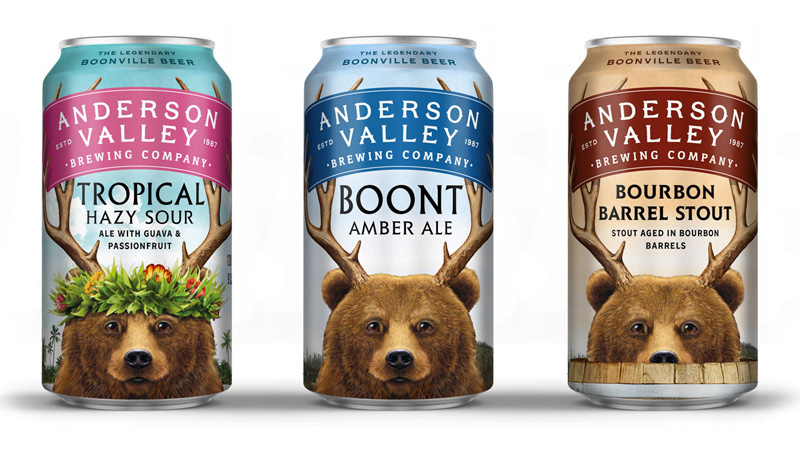
The new owners of Northern California’s three-decades-old Anderson Valley Brewing recently revealed their rebranded logo, packaging scheme, visitor experience, and community engagement philosophy. CEO Kevin McGee says they all combine to showcase the brewery’s quirky personality while paying homage to its history and breathing new life into an outdated and aloof organizational look and feel.
“The new graphics and imagery we used mesh well with [our increased outreach],” he says, describing the lovingly absurdist bear-with-antlers logo that’s served as an internal mascot since Anderson Valley’s earliest days. “The bear is up close and personal, making eye contact. It’s a consumer extension of the idea that we wanted to make a more meaningful connection and animate the brand to be more of a living thing instead of a can on a shelf.”
The fun-loving yet serious-minded illustration — whose bear and antlers accurately resemble real-life local versions — fits Arthur’s belief that a rebrand should celebrate the brand.
One thing Arthur does caution against is using a rebrand as a Band-Aid to hide from bad publicity.
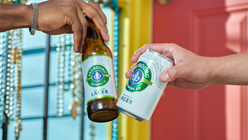
The marketplace of opinions demands scandal-addled commercial entities actually change their culture, not just their proverbial packaging. Faubourg didn’t abandon the charged word “Dixie” to performatively appear more racially sensitive. By guaranteeing a living wage, donating $1 from onsite sales of Faubourg Lager, and launching a program to hire and train locals with alternative skill sets (among myriad additional community campaigns), it’s demonstrating a genuine commitment to championing NOLA’s unique diversity and fostering a sustainable economic future for its citizens.
Hear this: It’s not about you.
“Microbrewers are just about the worst customer you can have,” says Tom Dougherty, founder of New York’s Stealing Share branding agency. While it may sound like harsh criticism, it seems the same thing that makes brewers great at their craft makes them less than savvy marketers. “These people are personally so involved in their beer they cannot look at it dispassionately. They see it as an extension of themselves. If you cannot look at your brand dispassionately you cannot improve it.”
Dougherty warns that beyond objectively analyzing your brand, you have to make your message about your customer, not yourself. In other words, he says, it’s not a matter of, “How do I perceive myself?” It’s, “How do my target customers perceive themselves?”
“The brand is not about the beer at all,” he says. “We buy things we believe are a reflection of who we think we are. ‘What is it about this that reinforces my sense of self?’”
For a brand’s creative director, that means doing research, research, and more research.
“If you don’t know what side of the bed they sleep on you’re not going to sell them beer,” Dougherty says.
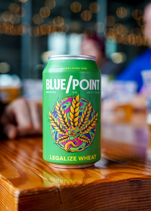
Blue Point Brewing general manager Carrie Shafir says she learned a lesson about the 23-year-old Long Island, N.Y., brewery’s customer base last winter when the brand’s redesign was met with mixed reception. While Instagram and LinkedIn followers generally applauded what she calls a “dramatic departure from the original logo and art,” Facebook followers expressed extreme displeasure.
Facebook users, who typically skew older than Instagram’s, blamed owner Anheuser-Busch InBev for the “corporate” and “soulless” iconography they said scrubbed any semblance of character that honored the former craft brewery’s seafaring and hippie origin.
“It has informed how we engage with different audiences,” Shafir says.
Even with the varied response, she considers the change a success so far, with a 7 to 10 percent jump in the number of shoppers considering a Blue Point purchase.
In San Francisco, a much older nautically themed brewery took to social media to defend its intentions against a storm of bitter comparisons to Applebees and other “generic” labels when it overhauled its identity for its 125th anniversary. Anchor Brewing, which was purchased by Sapporo in 2017, declined to comment for this story, but admitted at the time that it sought to steer itself out of irrelevance and into the younger generation’s rotational awareness. It tried to convince its followers that its altered artistic course didn’t signify a change to the liquid nor a departure from its roots. But the argument didn’t seem to hold sway. By eliminating embellishment in favor of what critics call “pandering” and a “millennial makeover,” fans despaired that the iconic Anchor made itself look cheap and out of touch.
Blue Point’s Shafir, who says she felt bad for Anchor, defends her own (relatively minor) controversial move, reflecting that “it’s easy for people to latch onto visuals. They’re something that is incredibly important but they’re not the DNA of the brewery; they’re on the surface. The core is still the same. It just looks a little different.”
Be collaborative. If you can’t be collaborative, be transparent.
Blue Point and Anchor both made the mistake of failing to prepare stakeholders for such radical redirects. Sharif wishes she’d focused less on staging “a big reveal” and more on contextualizing the change.
“Hold people’s hands,” Arthur agrees. “Let people know it’s coming. Explain why you’re doing it.”
Faubourg went further than that by inviting stakeholders to participate in its renaming. It listened to distributors, solicited suggestions, and shared its rationales from day one. Executives decided on the name “Faubourg” after a number of employees and members of the public nominated it. And it seems to have worked. Apart from the obvious absence of backlash from its community, Birch says the brewery has raised its fiscal year 2021 forecast to keep up with an unexpected surge in re-buys.
By opening up the process, breweries can build up excitement and generate content and media. Able Seedhouse + Brewery in Minneapolis kicked up the concept of collaboration by letting design students at a local college conceive and execute the can art for a new release as an academic project. Rogue Ales & Spirits in Newport, Ore., hosted a public can-design contest for the 30th anniversary of Dead Guy Ale.
Last and yes, least, set or follow current trends.
The unfortunate irony in the Anchor story, says Arthur, is that not only did it miss the boat (pun intended) on releasing its faddish hazy IPA to cater to younger adult drinkers when the style first got popular five years ago, but that same trend-chasing crowd would have appreciated the brewery leaning into its authentic vintage status.
In his 2021 Craft Beer Branding Trends guide, Arthur writes that millennials and Gen Z’ers “can’t. seem. to. shake.” the retro design “fetish.”
Visually bifurcated can art is also still trending (think Blue/Point’s reductive “buoy”-cum-slash), as are arched brewery and beverage names (Westbrook Low and Slow Helles), mascots (hello, Anderson Valley), and flashy 1980s-era fashions. For the year ahead, the CODO team recommends using non-beer beverages and other consumer packaged goods as inspiration. Chobani, they say, launched the look of a thousand beers.
If you’re an older brewery that lacks the budget or bandwidth to refresh or rebrand at present, you might consider upgrading your photo game. To make a real mark on the market in a post-COVID, direct-to-consumer world, prioritize sharp art direction, or, at the very least, pretty online product images.
After all, Arthur says, in 2021, it’s just as important to stand out on the digital shelf as the brick-and-mortar one.
This story is a part of VP Pro, our free platform and newsletter for drinks industry professionals, covering wine, beer, liquor, and beyond. Sign up for VP Pro now!