
This month, we’re heading outdoors with the best drinks for the backyard, beach, and beyond. In Take It Outside, we’re exploring our favorite local spots and far-flung destinations that make summer the ultimate season for elevated drinking.
Design is everywhere and beverage lovers are no stranger to its impact. Some of our favorite drinks hold a special place in our hearts for being notoriously ugly, while others have become a monument for alcohol packaging, but quite frankly taste mediocre at best. However, with new brands that redefine creativity and are flying onto the radar of design and drinks lovers alike through targeted ads and our explore pages, we’re learning we don’t have to compromise taste for looks.
Whether we like it or not, social media has become a vital part of sharing new brands and products with one another. Through TikTok and Instagram, drinkers are able to easily keep up with the current trends through a tag, like, and DM. Since we unfortunately have yet to discover technology that allows us to taste through our screens (I have high hopes for the iPhone 13), beverage brands are presented with the ultimate challenge: to catch the eye of a scroller before they keep swiping.
These beautiful brands extend across categories ranging from aperitifs such as Haus to botanical hard seltzers from Amass, to non-alcoholic mixers and spritzes from new producers like Ghia. We found that our favorites sufficed on their own or could also flourish with another liquid friend. The design trends were even more varied: minimalist to maximalist, retro to modern, muted to bright; but one thing is for sure — each one caught our eyes as much as our palates.
Of course, just because a drink looks cute, doesn’t mean it tastes cute. That’s why we’ve curated this list of delicious bottles and cans for anyone looking to deck out their bar cart, to buy a gift for their designer friends, or to be the star of the picnic.
7. AMASS: Sun Sign Hard Seltzer
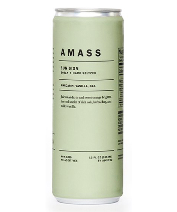
AMASS is a brand that most definitely falls into the minimalist design category. Heavily type-focused, the brand strays away from iconography and imagery to define its identity. Muted greens, beiges, whites, and blacks and a sleek sans serif paired with thin dividing lines create a clean and intriguing label atmosphere for the drinker, luring them in to find out what’s inside.
Our favorite Amass product is Sun Sign hard seltzer, flavored with Mandarin orange, vanilla, and oak. You wouldn’t necessarily guess the flavor profiles of these seltzers from their listed ingredients — nor the can’s color. Sun Sign is a seltzer that smells like its name and tastes like a tangerine and vanilla-laced dessert, but not too sweet. The flavor profile was so sophisticated and unlike any hard seltzer we had tasted before. The oak counteracts the vanilla and orange sweetness to produce a perfectly balanced experience. Visually, Sun Sign defies the usual citrus-to-orange visual connotation and opts instead for a muted pistachio can. Thoughtfully refreshing, these hard seltzers would be perfect for a picnic with your artsy friends and can be consumed across seasons.
6. Casamara Club Alta Amaro Club Soda
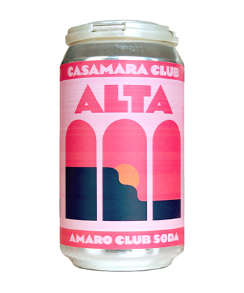
Casamara Club’s design approach is radically different from that of Amass. Leaning into a bright retro tone, its Alta Club Soda transports you to the Italian seaside with an illustration of a peach-colored sun setting into the bright pink solar-stained sky over coastal cliffs. This alcohol-free amaro-inspired soda is meant to be a sober take on the Italian classic cocktail, the Negroni. While we found the type hierarchy to be a little confusing through the singular retro blocky typeface used on the can, we still enjoyed the can’s design and content. The color palette beautifully resembles the taste of this lovely seltzer alternative — citrusy, youthful, and refreshing. The soda’s flavors tasted very natural, avoiding the usual artificiality associated with bubbly beverages (both alcoholic and non-alcoholic). This drink is perfect for a beach day or for dreaming you’re sitting in a charming Positano cafe.
5. Figlia 001. Fiore
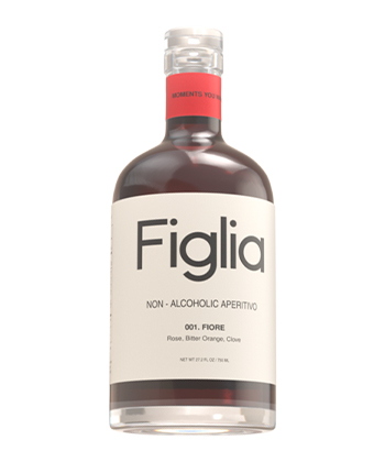
Look up minimalist packaging in a design textbook and you’ll find Figlia’s 001. Fiore. This non-alcoholic aperitivo label leaves much to the taster’s imagination — perhaps a wise marketing tactic to spark curiosity? — with a wide cream-colored band comprising the majority of the bottle, while sitting behind a clean and open sans serif logo. The label is still beautifully organized and gives way to clear hierarchy, allowing the drinker to easily navigate the flavor profiles, ingredients, and other details of the bottle. A thinner crimson red band at the top stem of the bottle (which clashes with the deep maroon color of the liquid) hints at the sobriety of the beverage with witty text that reads, “Moments You Want to Remember.”
The taste of the beverage is where this bottle really stands out. Warm and welcoming (a stark contrast to its design), Figlia feels uniquely nostalgic. The clove flavoring dances delicately with the floral and bitter aromas. While we thought this drink was lovely on its own over ice (per Figlia’s serving recommendation), we also thought its pairing opportunities were endless. The slight smokiness complements a mezcal (we used Madre, another beautiful bottle) while the spices make it ideal for a Hot Toddy twist or spiced rum during the holidays. We also thought this could be a lovely addition to a fruit dish or apple pie.
4. Ghia Le Spritz
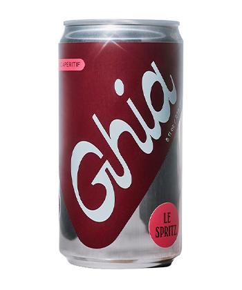
Female-founded and non-alcoholic beverage brand Ghia gives us a fresh take on the word “drinking.” Melanie Masarin, Ghia’s founder, says she was inspired by her childhood memories of the Mediterranean. A statement from Masarin on the brand website reads: “We wanted to make a drink that would take you to this place without numbing the night; a drink you’d remember in the morning.”
Ghia’s packaging flirts with maximalist design and has a whimsical quality that’s sure to stand out on the bar cart. “We worked with Perron-Roettinger to create Ghia’s visual identity and were inspired by hospitality signage and European aperitif brands,” Mesarin says. “We wanted to create something that was friendly, timeless, and that nodded to the irreverence of postmodern design, but with a modern mentality.”
The brand’s cranberry red, raspberry pink, and robin’s egg blue color scheme matches the drink itself. The bubbles in this canned RTD cut the thickness of the flavor and make this beverage even more palatable. It almost reminded us of a more sophisticated version of a San Pellegrino soda. This can would be ideal for outdoor drinking or to bring to a party as a designated driver — you’re sure to still taste the feeling of celebration.
3. Haus: Lemon Lavender
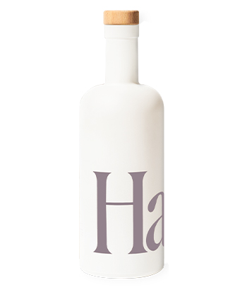
Ask any drinks-loving designer to name a bottle with notable design and they’ll probably without hesitation say “Haus.” Haus has become an iconic brand in terms of its bottle design and packaging. Haus uses a curvy condensed sans serif logo to occupy half the matte white bottle. While the original bottle packaging uses the logo as a cutout into the matte white packaging to reveal the flavor inside, the brand has recently updated its bottle to have the color of the logo be opaque and correspond to the flavor. It’s clean, consistent, straightforward, warm, and sophisticated — what more could you ask for? Haus also excels in the accessibility of its design through the varying sizes. Each flavor comes in a 750-milliliter single bottle, but you can also purchase a sampler kit, which includes four clear glossy 200-milliliter bottles of your choice (an option that’s ideal for gifting, especially to a picky friend). While we very much enjoyed the Ginger Yuzu and Bitter Clove flavors, Lemon Lavender was our favorite. The scent of the Lemon Lavender reminded us of Lillet and the taste resembled a faint vanilla powdered sugar or lemony-baked good taste (think: Madeline cookies) with a cleverly contrasting bitter aftertaste. This bottle avoids the common flaw in lavender flavoring of tasting soapy and creates a warm and inviting experience for the drinker. This flavor would pair seamlessly with a vodka or gin cocktail.
2. St. Agrestis Inferno Bitter Aperitivo
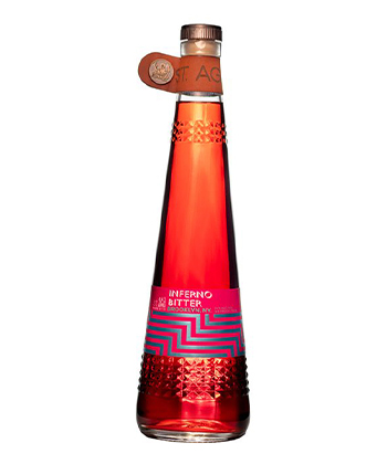
If you’re looking for an aperitivo bottle that both looks and feels high-quality, look no further. St. Agrestis immediately sparked our interest. The conical bottle exceeds in whimsical maximalist design as a stud-like glass relief wraps around the bottom third, a pink label with geometric metallic blue patterns provides us with our information, a leather tab with a bronzo logo fastener precedes the top of the bottle, and a delightfully heavy bronze and marble-like cork tops it all off. Evidently, there’s a lot going on, but it works really well.
If you’re into bitter aperitivos, this beverage is delicious on its own. It’s not as bitter as the St. Agrestis amaro, making it more digestible. The Inferno Bitter Aperitivo smells like spicy cinnamon, and is wonderfully warming in the throat. We find this ideal to use for a Negroni or any other bitter cocktail. St. Agrestis also sells a Negroni that comes in an adorable and transportable 100-milliliter bottle. If you want to impress your guests with a post-dinner drink, the Inferno bottle is for you.
1. Zuzu Passion Fruit
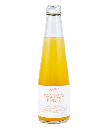
Zuzu is a perfect example of a brand identity that is leaning into design trends in the best way (or at least our designers would say so). The Passion Fruit bottle’s monochromatic orange color scheme seems like a logical choice for the flavor. The label is warm like the sunny golden color of the liquid behind it, but doesn’t clash with it. The combination of duo-tone color treatment, sans serif justified text, and sporadic doodle markings are elements with which designers are increasingly familiar.
The agave-based drink itself tastes like a warm sunny day. The passion fruit, calamansi lime juice, and sea salt mix together to create a wonderfully balanced light and sweet drink with a doughy aftertaste. We thought the almost cookie-like aftertaste was fascinating and rare to find in a drink with such tropical flavor profiles. This drink is perfect for that friend who doesn’t really like the taste of alcohol, or for beer lovers looking to branch out into the low-alc, low-cal category.
While this design appealed to our art team, it is important to note that it’s not necessarily accessible for the average drinker. The inconsistent kerning of the justified text blocks can be difficult to navigate. Then again, maybe that’s the fun of it.