
More than ever, consumers are selecting wine bottles based on aesthetics. But back in 1998, when Dave Phinney started making wine under his own label, Orin Swift Cellars, winemakers typically stuck to the same traditional, monotonous bottle designs that crowded wine shop shelves. Phinney was one of the first to make a splash with his provocative and edgy labels, most notably the striking red-and-blue Francisco de Goya etching of a man in chains that cloaked The Prisoner Red Blend in 2000. This wine put Phinney on the map, and with each new release — including recognizable bottles like Mannequin, Machete, and Papillon — customers became more enthralled with the maker’s evocative designs and bold flavor profiles.
Phinney’s unique red blends and standout labels soon propelled Orin Swift Cellars to cult status, leading the winemaker to close blockbuster deals with industry giants: He sold The Prisoner to Huneeus Vintners in 2010 — who later sold it to Constellation Brands for $285 million in 2016 — and E. & J. Gallo acquired the Orin Swift Cellars brand in 2016 for $300 million. Phinney has continued to work with Orin Swift Cellars since the sale, releasing new wines for the retail market as well as exclusive one-offs for the brand’s Equinox wine club.
Now, bottle shops are chock-full of labels boasting technicolor illustrations, cartoon characters, and eye-catching art. But while other brands are just catching up, Phinney is taking his commitment to design to the next level with his latest project: the new Orin Swift Cellars tasting room in Napa Valley. While many winemakers aren’t deeply involved in building their tasting rooms’ aesthetic, Phinney approached the new venture with the same passion and intensity that he does his wines. In addition to being easy on the eyes — more on that later — the location will offer an accessible range of tasting experiences from $40 to $125 per person, with completely customizable tastings available at the higher levels.
Here, Phinney shares details about the tasting room and his take on the extravagant labels now hitting bottle shop shelves.
1. Is it difficult to balance taking creative risks with keeping the wines and labels that originally made Orin Swift Cellars so popular and recognizable?
We’ve definitely established a certain style. I think people know what to expect from us within reason, but we like to challenge ourselves. Otherwise, we’re just either going to get complacent or just be spitting out easy stuff, so it’s about finding the balance between what we’ve established as our style and taking risks. We would much prefer to take a risk and be the first to a design than play it safe. Every once in a while, like with Palermo, we got really lucky and found an image that we barely edited. That doesn’t happen often — and quite frankly, if that happened again, we would probably not do it because it’s too easy.
Any time we come up with a new label, especially if it’s going into wholesale, we will line it up with the rest of the family to see if it fits. If you look at Machete, Papillon, and 8 Years in the Desert, it’s obvious that they are very different labels. But to me, it’s pretty easy to see that the wines are coming from the same brand.
2. As a producer known for making waves with distinctive label art, how do you feel about the current state of wine labels on the market?
When it comes to looking at what other wineries are doing, I think it’s extremely dangerous to put no credence on it, but it’s just as dangerous as trying to copy or play catch-up. Rather than comparing our bottles to other producers, we like to look outside of wine to fashion, design, architecture — you name it — for that inspiration.
I’m excited to see all of the experimentation. It’s still insane to me how little disruption and innovation there’s been, though. You can still go to a wine shop and look through a bunch of similar-looking Bordeaux bottles. And then you see a lot of attempts at avant-garde labels that seem uninspired and have probably been distilled down from what the original interpretation was. It’s an interesting balance because, selfishly, from a business standpoint, I’m glad to see that there’s still a lot of laziness. But then there’s those that are beautiful and done exceptionally well. I’m thrilled when I see those labels because I’m like, ‘Finally, someone’s actually doing something cool.’
3. The labels for the more affordable Locations series are nearly opposite of the typical Orin Swift labels in terms of style. What was the reason for the more straightforward approach?
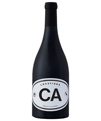
Minimalism is way harder than most people think. We wanted to challenge ourselves with that. We’re really good at the $35 to $200 bottle labels where there’s really no budget and we can go nuts. But we wanted to see if we could make a wine with mass appeal at a lower price point, and the Location wines were really successful at that.
4. What was your goal with the opening of your new tasting room?
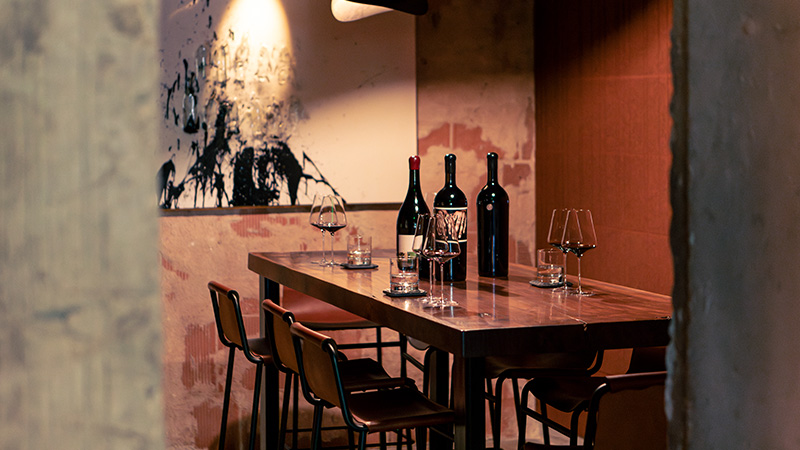
There were several goals in mind as we thought about opening the new tasting room for Orin Swift Cellars. First and foremost was to create a selection of new, exclusive, direct-to-consumer wines. It was also very important that these be spread across the three tiers of tasting offerings. We wanted to be sure that there was a wine and experience for everyone, so we created three options: Rock, Paper, and Scissors. Rock is our most accessible and casual tasting experience and includes several wines presented at the bar space. Paper is a more curated, sit-down experience hosted by an individual staff member, and Scissors is a highly bespoke offering hosted in its own space adjacent to the main tasting room.
5. What is the most important aspect of the tasting experience?
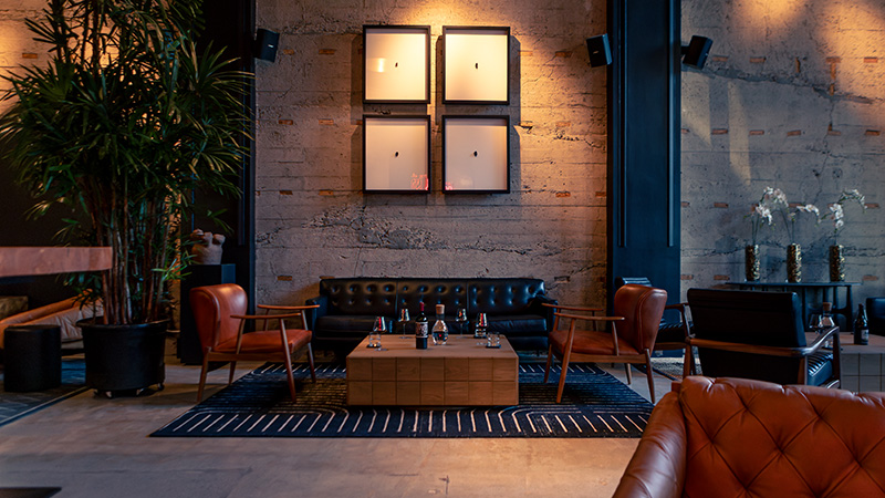
The most important aspect of the tasting room is the flexibility we created to cater to all our guests. The setting is meant to be welcoming rather than stuffy or stand-offish. We want to make our guests feel as if they are enjoying the wines in our creative space or living room. In short: Make it comfortable and let the wines do most of the talking. Each piece of the furniture, artwork, and other decor has a story of its own, and was carefully selected to complement the experience.
6. What was your approach to designing the tasting room?
The design process for the tasting room was similar to how we design wine labels in the sense that it is highly personalized. From the façade to the lighting to each piece of art or furniture, there was a purpose behind each decision. We spent months agonizing over the smallest details, so much so that in the end I started dipping into my own collection of art and curiosities to make sure the feeling was right. The fun is going to be in how we evolve in the space and continue to make it special in the future for all our guests!
This story is a part of VP Pro, our free platform and newsletter for drinks industry professionals, covering wine, beer, liquor, and beyond. Sign up for VP Pro now!