
Whiskey writer Clay Risen was having a discussion with his publisher about the look of his upcoming book, a study of rye whiskey, due this fall. His previous volume about American whiskey had had a black cover. A subsequent book on Scotch had a blue cover. What shade should the rye book be?
“When I was talking with the book designer, there wasn’t much discussion,” says Risen. “The book cover was going to be green.”
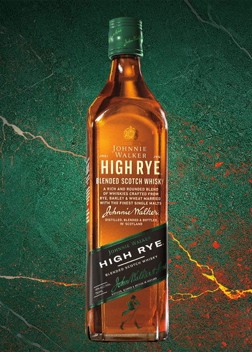
Risen and his publisher were only following the lead of nearly every rye producer who has launched a bottle during the great rye whiskey revival of the past decade or so. Stroll down the rye aisle at any liquor store in America and you’ll be seeing green. The labels of Bulleit, Woodford Reserve, George Dickel, Jack Daniel’s, Michter’s, Knob Creek, Crown Royal, Elijah Craig, Hudson Whiskey, Ezra Brooks, Wild Turkey, WhistlePig Farmstock, Basil Hayden are all either full-on green or have a signifying touch of green somewhere in their design. Even old rye brands, like Jim Beam, which used to have a yellow label, have gone green. And the trend has crossed the ocean. When Johnnie Walker recently came out with its “High Rye” blended Scotch, the company took green as its color.
“It’s become sort of associated with it,” says Noah Rothbaum, a spirits writer, whiskey expert, and the co-editor of the recent “Oxford Companion to Spirits and Cocktails.” Rothbaum notes that there is little to no historical precedent for this modern phenomenon.
“If you look at the other ryes that were made in the dark ages” of the 1970s through 1990s, he says, “Jim Beam used a yellow label; Old Overholt is a white label; Rittenhouse Rye, there’s no green there.” Wild Turkey Rye has long had a touch of dark green in its packaging, but not enough to account for the dominant role the hue plays in today’s current market.
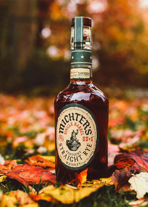
“Anecdotally, it’s quite possible that green becoming synonymous with rye is a more modern development,” says Joe Magliocco, president of Michter’s Distillery and founder of its parent company, Chatham Imports.
Magliocco may have something to do with that development. In the late 1990s and early ‘00s, when the Michter’s team was working on the design for what would become its rye, Magliocco gravitated toward green. “Green went with the feel we wanted,” he explains. “When I think of red, I think of sweeter things. Green is a little spicy, a little herbaceous. Rye is also a winter crop and green can be a sort of winter color.”
That feeling is shared by others. Without having known Magliocco’s thought process from 20 years ago, Risen muses, “I think of rye as being an herbal spirit. The notes that come to mind first are herbal notes — thyme, basil, bell pepper. Rye works better as a younger spirit than bourbon does, so I think green speaks to that as well. There’s a youthfulness to it.”
Whatever early role Michter’s may have played in associating rye whiskey with the color green, 2011 seems to have been the year the rye revival went fully verdant. That was the year both Bulleit Rye and Woodford Reserve Rye were released. Both had green labels.
Chris Morris, the master distiller of Woodford Reserve, would have you believe that the Woodford rye got its label simply because he said so. “I said it should be green,” Morris says. “It’s my favorite color. My dream car would be hunter green.”
If Woodford Reserve Rye going green was the decision of one man, Bulleit’s design was the work of a village.
“One of the choices we had to make was what color label,” says Steve Beal. A whiskey business veteran, Beal worked with liquor giant Diageo on the launch of both Bulleit Bourbon and Bulleit Rye in the San Francisco area, where the brand first took off. “It had to be easily identifiable.”
There was something intangible about green that made sense to both the executives at Diageo and the various bartenders Beal polled. “People thought green sent the right signal,” he recalls. “And others thought it was just a nice color. There were no green labels on anything, anywhere. We thought it was very beautiful and compatible next to the orange label of the bourbon. Bourbon is a sort of friendly, warm feel, because of the russet hues of the liquid. There wasn’t a color that worked quite as well as green for the rye bottle.” (When Beal suggested blue as a possible label direction, bartenders objected immediately, saying “Blue is not a rye color.”)
When Bulleit Rye quickly became the sales leader in the rye category, and held that position for many years, its choice of label color became very influential. Green-labeled rye brand after green-labeled rye brand followed.
“Certain iconic packaging is mimicked by other brands,” says Rothbaum. Beal puts it more bluntly: “Sometimes the liquor business is accused of having a lack of originality.”
Now that the industry and the public have collectively connected the color green and rye whiskey in their minds, Beal believes there is probably no going back on the color-coding of what has become one of the hottest spirits in the world.
“Having a label that makes sense to consumers — even though it’s an odd connection — why go against the grain on that? People go into a store, they’re into rye, they see a familiar green label, they buy it!”
“A blue label,” he adds, “maybe not.”