
The thing that has stuck with me the most from our tour through the beer advertisements of yesteryear, outside of an intense curiosity about which prehistoric animal Fred Flintstone and Barney Rubble would cruelly enslave in order to keep their draft beer cold, is a latent affection for Michelob’s iconic teardrop bottle.
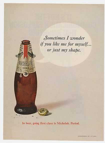
I’m certainly no aesthetician, but there’s beauty in those old bottles. Even if you find them ugly, there’s a certain utility value in their distinctive, immediately identifiable shape. Back in 2002, though, Michelob didn’t see it that way, telling the Chicago Tribune this triumph of the form was badly dating the brand portfolio.
“We need to recast the image of this brand younger,” said Bob Lachky, vice president of brand management and director of global creative at the brewery. “You have to tell non-Michelob drinkers that they aren’t drinking yesterday’s beer.”
Great idea, man. You’ve got something that’s visually recognizable to millions of people at a glance, which is more or less the entire goal of the concept of advertisement, and your thought is that you gotta blend in a little more. Talk about a Real Man of Genius! (Lachky is also credited with the “Whazzzzzzzzuppppp?” and Bud-Weis-Er frogs campaigns; he left the company in 2009 to pursue making more stupid crap elsewhere.)
Despite that extremely compelling argument, other brewers seem to have finally recognized what virtually every industry on Earth has already discovered: nostalgia sells. Maybe “yesterday’s beer” is still pretty cool, after all.
It is if you were drinking Miller Lite yesterday, anyway. That company’s 2014 reversion to an “old” label design flipped slumping sales trends on the order of 15 to 20 percent in some markets. What Miller found out with their “limited time only” gamble (a phrase which, by the way, means “we’ll keep it if it sells a buttload”) was that people preferred unique and authentic styling to overproduced, safe, corporate design. Well, how in the hell were they supposed to know that!?
These days, though, bottle shape decisions seem positively, well, Flintstonian. Aluminum cans have reemerged as the vessel of choice for liquids everywhere — to the point of mass supply failures, even — and the people who make the liquids that go in the cans are taking advantage of an enlarged branding canvas.
Geiger Powell, a former director of marketing and graphic designer for a prominent craft brewery, told me he prefers cans as both a thinker and a drinker.
“As a consumer, I definitely prefer cans,” says Powell. “They get cold quick and you don’t need a bottle opener to get the beer out of them. You use one hand to hold the can and the other one to crack it open. Doesn’t get any simpler.” I didn’t mention to Powell that some beer bottles are twist top.
He continued, “Design-wise, I prefer the can to the bottle because you have a much larger palette to work with. All things being equal, a well-designed can wins over a well-design bottle label.”
It’s hard to argue with that, frankly. When I try to think of the most memorable designs from the beer aisle, virtually all of my favorites are of the short and stubby variety.
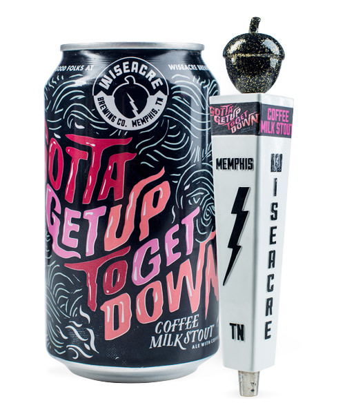
There’s Wiseacre Brewing’s frenetic, jittery Gotta Get Up To Get Down Coffee Milk Stout, which does a better job of communicating caffeine content than any bean water iconography I can think of. And Narragansett Del’s Shandy, which I’ve already mentioned, but which also deserves a second look if only out of respect for the cajones it required to make a yellow and green beer can.
Last week, 21st Amendment won the first-ever Beer Idiot Award for Best Deck Beer, but I think some of their can artwork could just as easily win The Most Kickass Badass Beer Can Art Award. The serape-style shawl on their El Sully lager is one of my favorites. Unless it’s problematic, in which case I hate it and it’s bad, and I never liked it. Boooo.
Powell told me that Almanac Brewing’s minimalist, monochromatic designs are among his favorites, and praised the “isometric, iOS game” look achieved by the top-down point of view. I like them, too, even if the font seems like it clashes a bit.
It made me wonder how much freedom designers get when sketching out ideas, and Powell says there’s a lot of back and forth.
“[It] depends on the project, but most of the time if the beer has a name that references something very specific, the brewery will have a vision in mind for the label and it’s your job to replicate it as closely to what they want as possible. When you fail to do that after several attempts, they give up and let you do whatever you want. It rules. Sometimes they’ll say ‘go nuts with it’ and then you go nuts with it and they hate it.”
On the other hand, sometimes they let you get away with some nutty stuff, like turning Gandhi into a shiny chrome automaton and getting everyone in trouble. So maybe it balances out.
Predictably, Powell tells me large companies are more sensitive to potentially offensive designs. “The difference is massive,” he says. “Large corporate entities think about every tiny detail on the label designs and how Group A will be affected by this detail and if Group B will react negatively to what Group A likes. Craft breweries just want hop puns and Star Wars/The Big Lebowski references on every label.”
That explains why there are so many marmots on beer labels now.
But to be fair, there’s some great art on beer bottles, too. Hell, maybe there’s some in museums even? Not sure.
The bizarre, milk-like opaque finish to bottles of Delirium Tremens immediately comes to mind when I think of fantastic bottle art. It stands out especially well among other entries in the Belgian style, which for whatever reason tends toward stodgy, plain designs.
On the other hand, nobody does traditional design better than Stella Artois (lots of people do beer better, but that’s not the point).
And at the risk of sounding like a broken record, Ballast Point’s labels, and the styles on which their undead admiral mascot makes an appearance in particular, are some of my most beloved industry-wide. Although you could make the argument their cans are even better, with a simpler and more evocative design language, I won’t. I mean, just look at that little parrot guy up there. He rocks.
So what happens when we get tired of what we can do with bottles and cans and clapping our hands? Again, I asked Powell where he saw the industry going.
“I’m really hoping craft breweries embrace the aluminum bottle that up until this point has been ubiquitous with macro beers strictly to be used for tailgating,” he says. “But they’re literally just cans in a different shape. It’ll take one really good craft brewery to buck the trend and start using them and then everyone else will follow suit.”
Well, brewers? Anybody want to recast the image of the can younger? Or are you all still stuck on “yesterday’s beer”?