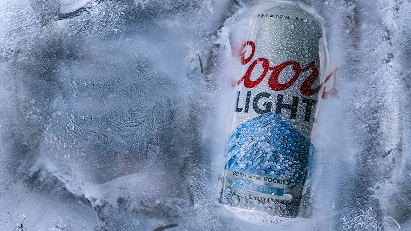
Coors made headlines back in 2007 when it took the idea of grabbing a cold one to the next level. In a stroke of marketing genius, the brand launched a new line of products with labels that changed color when refrigerated to the optimal temperature.
Spurred by sales growth resulting from the firm’s “Rocky Mountain Cold Refreshment” marketing focus, Coors collaborated with Inland Packaging to create the thermal-sensitive labels. This innovative feature made it easy to know when beer was too warm to serve, and the color signaled bartenders when it was time to offer patrons a new drink.

While Coors maintains that the details are a trade secret, observation has shown that during the chilling process the mountains adorning the labels begin to turn blue at 48 degrees Fahrenheit and reached their full color at approximately 40 degrees. The trick behind the color-changing design was thermochromic ink, developed by color-change technology and graphics company LCR Hallcrest, used to print paper labels that decorated the company’s 12-ounce bottles.
Thermochromic ink is essentially a mixture containing three ingredients: a color base, a color developer, and a solvent, which causes the color to change as it melts.
Sales of bottles increased significantly after the release, and given the popularity of the design, Coors Light released a 24-ounce cold-activated can in 2009 and looked to expand the offerings. For the scope, though, technological limitations proved difficult to overcome, until Cornell University graduate Lyle Smalls’ Chromatic Technologies, Inc. took on the task. After three years of research and development, Smalls developed a chromatic ink that was suitable for aluminum cans and mass production.
In 2011, the brewer flirted with a two-stage cold-activation design and used the star power of Ice Cube to help launch the initiative. These labels indicated when the brew had reached “cold” and “super-cold” status.
https://youtu.be/F-xjXBJtErI
By 2014, Coors Light was available in cold-activated cans of all sizes, in addition to bottles.
As with all things taste-related, the idea of a “perfect” temperature is subjective. Consumers in China prefer a warmer beer, so Coors had the ink’s sensitivity adjusted so that the mountains turned dark blue closer to 43 degrees F.
Now, 14 years after launch, Coors Light’s cold-activation charge is something of a slogan: “When the mountain turns blue, it’s as cold as the Rockies.” The lasting success of the interactive marketing campaign proves that the color-changing design is no gimmick. Sticking a few beers in the freezer from time to time to expedite the chilling process is something that most people can relate to, and thanks to Coors Light’s unique design, it’s easy to tell when they’re ready to drink.
