
As consumers, it’s often easy to feel overwhelmed by a sea of options. Beer lovers are no strangers to this. We’re constantly being kept on our toes, looking out for beer’s next big star, while also enjoying the classics. Innovation can be a double-edged sword for breweries: Options equal competition. How do these delightful beverages stand out from one another on the shelf? Design.
Walk into any beer seller and see cans trying to tell a story — through type treatments, illustrations, color schemes, and even textures, these little vessels all vie for our attention at the same time. Whether it rings true or not, for some shoppers, the label is a preview of the beer inside.
Beer labels have carved out their own special corner of the design industry. In fact, some designers like Keever even specialize in designing suits for stouts, pale ales, IPAs, and more. In a way, the beer and design industries have signed an unspoken agreement that’s mutually beneficial for both parties: Designers help breweries put their best look forward, and breweries allow designers to frolic in a creative playground.
VinePair’s design team can’t help but notice when trends in beverage aesthetics cross our desks. Design is a collaborative process; as designers, we draw inspiration from what we see around us. It’s inevitable that certain themes and patterns have emerged in the beer world.
While the categories in beer design are limitless, we’ve decided to highlight the looks that we’ve found most popular lately, with imaginative and intriguing works from breweries and artists around the world.
Geometric
When taking a look at today’s hottest beer design trends, it’s important to distinguish between minimalism and geometric labels. While the two worlds can collide, geometric designs don’t necessarily have to look clean and can still portray concretely visual design. Such illustrations of shapes and patterns are more abstract and sometimes more representative; but they always play the primary role in the label’s visual balance.
Japanese designer and brewer Kota Kobayashi’s Ippon Matsu is a beautiful example of where geometric starts and minimalist ends. A white lone pine tree composed of rectangles and triangles sits at the center of the clear bottle, while a vertical label with handwritten text lies on top of the hinged bottle stopper. The tree, while simple, is still representative and iconographic. This soft-spoken visual is actually linked to the name and story behind these beers.
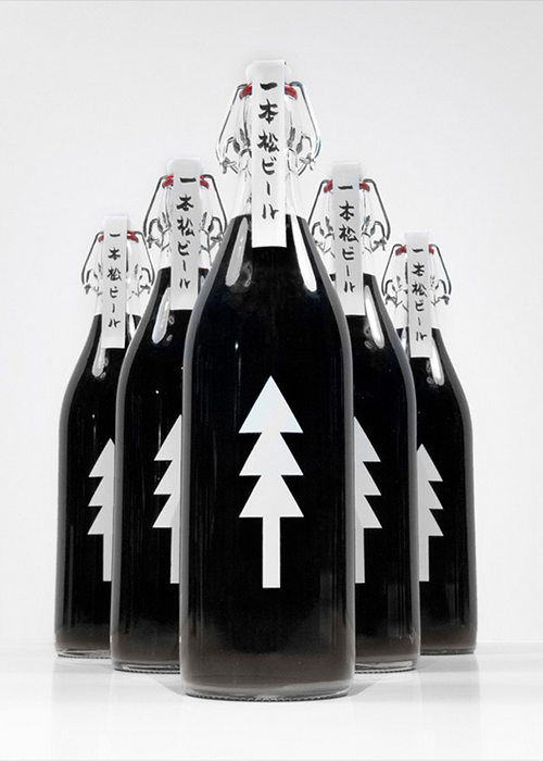
Kobayashi wrote of the 2012 release: “This beer’s name means ‘One Pine Tree’ and its design is a symbol of charity and hope for Japan’s brighter future. A scroll-like, handwritten label seals the top with its story written on the inside. The label is a solitary pine made of three triangles facing up, symbolizing the wish for progress in the reconstruction efforts.”
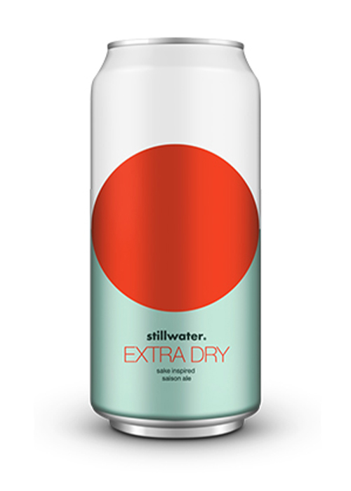
Interestingly, we noticed that many craft beer brands follow Ippon Matsu in the Japan-inspired geometric category. Sake-inspired Stillwater Extra Dry is an eye-catcher: A recent redesign of its already geometric label emphasizes even more its bright red circle reminiscent of the rising sun; in the Japanese flag sits at the foreground of the can as light blue and white color blocks act as its background. This starkly contrasted design between the round and the linear shares conceptual space with Japanese Zen design. (Zen design originates from Buddhism and celebrates eliminating frills and focusing on the essentials.)
New York’s female owned and operated Talea Beer Co. navigates the geometric route in a maximalist method. Bright layered circles, squares, triangles, squiggles, and lines adorn these cans, reflecting an idea of freshness and innovation. I Want Design, the mastermind agency behind Talea’s lovely visuals, described the identity to have “bold colourful graphic shapes have been used to great effect to give the brand a unique visual style with real impact.”
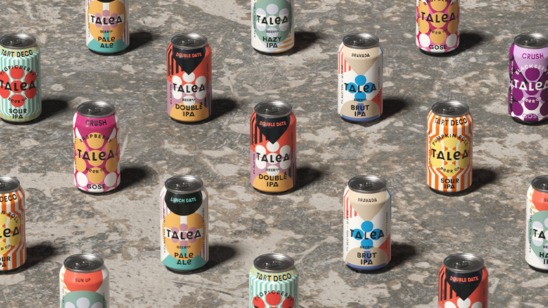
Even the beer information cans lie on a circular plane, which serendipitously complements the picture behind it. While these cans use clearly defined solid shapes, they’re loud and conversational — the best way to draw attention.
Inspired by Piet Mondrian, Modal Community Brewing’s Mondrian Saison follows the father of geometric art in both the beverage itself and the label. This beer is an art history nerd and beer lover’s dream: Mondrian’s work, which has become an iconic trope in design cannon (arguably introduced into the world of products through Yves Saint Laurent’s iconic fall/winter 1966 collection) funnily bears resemblance to the Modal brewing logo without intention.
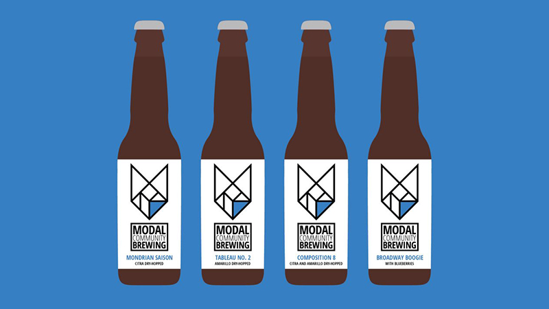
“The similarities between Mondrian’s minimalistic style and our logo were undeniable. Love it,” Modal Brewing’s Jay Mathes writes about this beer’s origins. To further follow the Mondrian theme, Modal colors the lower right sector of the logo in Mondrian’s signature cobalt blue. The two styles work seamlessly together to create a label that represents the bottle to its core.
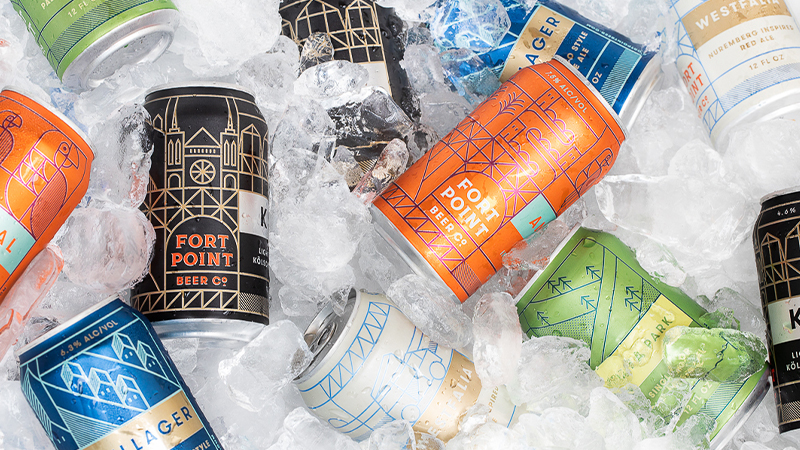
Fort Point Beer Co. also uses a grid-like approach to its branding. Based in the Bay Area, with several locations, this brand has an established language that extends across all of its packaging, but portrays varying geometric scenes according to the beer title. Through angular line drawings that neatly fall within grids, Fort Point tells the story behind their creations through polyptych scenes that feel almost like medieval stained glass windows.
Minimalist
On the opposite side of the beer design spectrum lies the minimalist label. These labels appear to be a countermovement to their idiosyncratic and sometimes nonsensical psychedelic foes. The beer names, while still sometimes playful (or, at least, not necessarily straightforward), are calming, consisting of few words or syllables that roll off the tongue like a babbling brook. Their designs match the sensation, often serene or perhaps meditative, testing the boundaries of one or few design pillars at a time.
Brooklyn-based Other Half’s Laid Back Peach Sour IPA shines the spotlight on color in its designs. This label leans heavily on its title as a peach-colored ombre cascades over the entirety of the can. Typography plays a more minimal role: The beer’s title, alcohol, description, and other important information sit quietly at the bottom of the label in a small simple Sans Serif, a type treatment that has become a signature of Other Half labels, even those that feature illustrations.
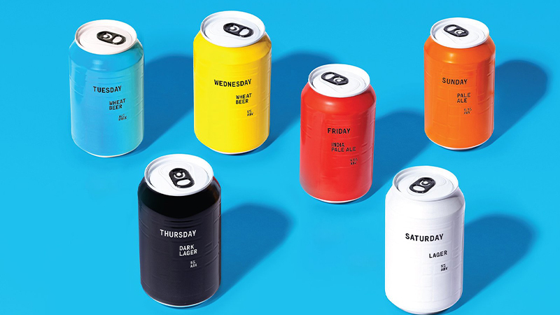
Munich-based beer makers AND UNION also opt for an all-caps mono-weight Sans Serif typeface for its labels. Named after the days of the week (excluding Monday?), AND UNION’s minimal beer labels focus on texture. While the brew information is more front and center than Other Half’s, an imprinted rectangular is the real star of the series. Their texture is a sure standout even on the screen; one can’t help but want to feel these beers firsthand. They look, dare I say, oddly satisfying — in fact, these raised/unraised shapes remain the same on all the cans, becoming a uniform for the AND UNION brand. This pattern has allowed AND UNION to easily translate its brand identity into more illustrative media such as editorial art, advertising, and even infographics.
Another standout in Brooklyn, Wild East Brewing Co. takes a similarly uniform approach to label composition. The brewery’s cans and bottles follow the same composition: A block charcoal grey encompasses the upper three-quarters of the bottle or can containing the beer name in a vertical orientation. An accent color box contains the Wild East logo on the bottom quarter.
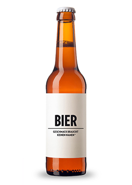
Berlin-based contract beer brand, Geschmack Braucht Keinen Namen, takes minimal to visual nudity. It starts with the brand name: German for “taste doesn’t need a name,” it focuses on a message of simplicity and content. “Our products have neither a name, nor a logo,” Geschmack states on its website. “Behind them stands a simple message: to never promise more than we can deliver; forgoing all marketing blah-blahbery and showing a middle finger to the visual pollution humanity is relentlessly subjected to via product advertising and branding.”
This raises red flags for beer lovers. What kind of beer is it, exactly? Buyer beware, but this label is a champion of the minimalist beer design movement. Typography is the most important factor of this design. Color is a non-factor as a condensed bold sans serif “BIER” in black while the brand name lies below a dividing line. Even the typeface between these two elements is the same, differing only in weight. While the lack of information on this bottle probably leaves people wanting more, it’s also provocative for what it isn’t willing to show.
Psychedelic
Imaginations of beer label designers can run wild. Psychedelic and surreal designs have been painted on countless beer labels lately. Often, these designs reflect the playful funky name of the brews, immediately sparking interest of customers strolling by. This beer label trend definitely utilizes the power of shock value. The visual stories these mind-bending labels tell are often so bizarre and outlandish, one immediately asks: WTF is inside this thing?
Take Fuzzy Baby Ducks by New England Brewing Co. as an example. The name in itself is eccentric, but when you see an image of ducklings with dilated pupils gleefully taking a joyride down a saturated rainbow that is crowning out of the anus of a unicorn, you might just wonder, is everybody at this brewery a genius, or just stoned?
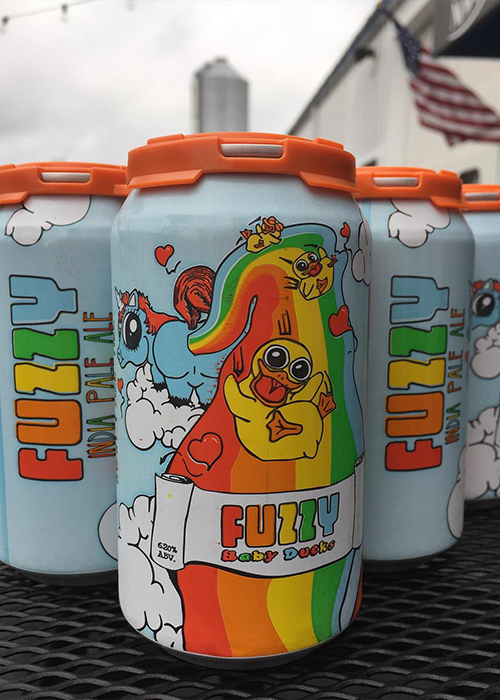
Whatever the answer to that question may be, consider our attention grabbed.
Brazil-based Hocus Pocus has opted for the hallucinogenic approach in many designs. While evoking a dream state, Nothingness and Derealization IPA labels also explore the imagination in a creepy, existential-crisis type of way. The dark earthy tones, all-knowing floating eyeballs, god-like giant hands, and looming columns might make you wonder if sipping Nothingness will finally reveal whether Jay-Z and Beyoncé are really part of the illuminati.
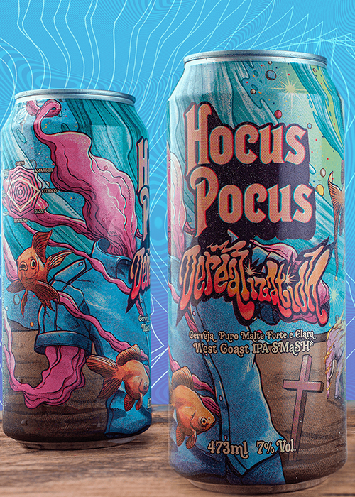
Derealization might make Salvador Dalí beam with pride: A large gray hand (perhaps the same one from Nothingness?) is planted into the ground, while a melting gum-like figure dissipates into the atmosphere; as a floating goldfish, a pink burning elephant, and another omniscient eye ignore its demise. While these labels are absurd, and arguably false advertisements of trance-like experiences, one thing is for sure: They sure set a scene.
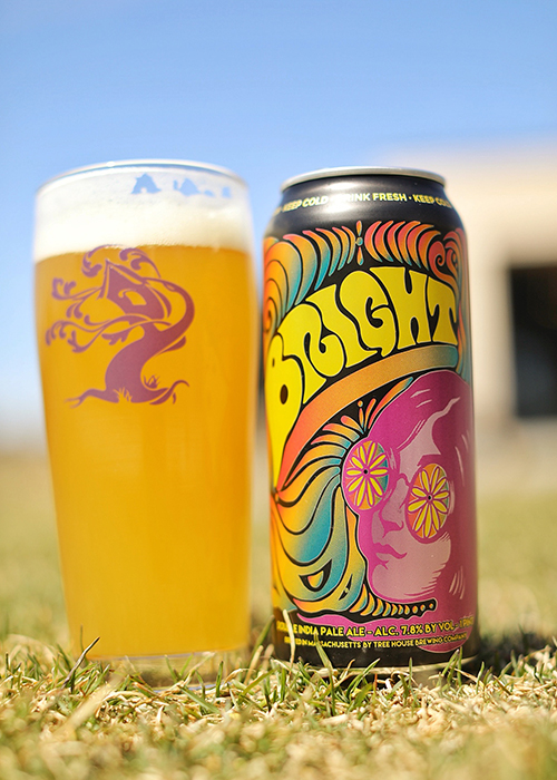
Artists like Keever, a western Massachusetts-based freelance illustrator, have taken a more traditional approach to the word psychedelic. Through his work with Massachusetts darling Tree House on Bright, Keever has illustrated a dreamscape that could be in the textbook definition of “triptastic.” Keever portrays a long-haired hypnotized figure (who comes close to resembling John Lennon, the hero of the psychedelic aesthetic) staring through floral-laced sunglasses at a rainbow abyss of dancing organic shapes. The can is nearly unbranded and sets the tone for the relaxing sensation of this double IPA.
From minimalism to imaginary illustrated landscapes to bold colors and linear shapes, beer design trends are challenging us to think about what’s next in this ever-evolving industry. While the liquid can speak volumes, it’s often the label that tells us the story first.