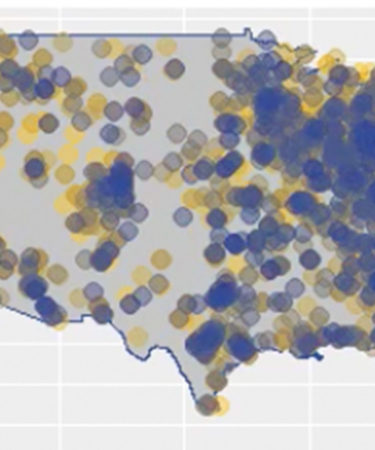
By the end of this year, a record 7,000 breweries will be operating in the U.S. The numbers are so astounding, it’s almost impossible to visualize. Unless, of course, you’re Bart Watson, chief economist of the Brewers Association.
In a recent tweet, Watson (@BrewersStats) posted an animated map showing the rate of U.S. brewery openings grouped by month from January 1900 to January 2018. The 20th century shows gradual growth, with brewery openings starting to pick up in the 1980s, ’90s, and early 2000s. But the real explosion comes in the last few years, between 2014 and 2018. Watch it here:
Animated map of U.S. brewery openings grouped by month. The explosion in the last few years is incredible. pic.twitter.com/SaPFuNXICl
— Bart Watson (@BrewersStats) August 31, 2018
The map depicts more than 6,600 breweries currently active in the U.S. (excluding Alaska and Hawaii). Brewery numbers are represented by colored dots, with each color shade (yellow to dark blue) representing 10 percent of total breweries over time. When a color changes, this signifies a new decile of breweries by founded date, Watson explains.
Another staggering statistic: 75 percent of the breweries depicted still only equate to .5 percent of the U.S. beer market, Watson points out.
Sometimes, math hurts.
