
No one interviewed for this story says they don’t actually like it. Tobias Holler, who is largely responsible for bringing it to the U.S. in the first place, uses the tactful word “dated” before describing how nice the glass, the foil, the paper is — basically everything except the thing itself. And Mandy Naglich, author of the recent book “How to Taste” who’s been brewing and writing about beer for years, says it looks like something you might design if you knew absolutely nothing about design. Like “you tried to make an invitation on your computer or in Microsoft Word or something,” she says. “Or a bad billboard.”
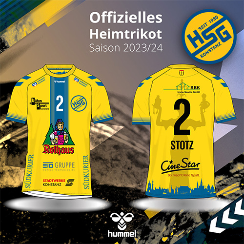
The thing they’re talking about is the label design for German brewery Rothaus. For decades now, the artwork affixed to every bottle in every style they brew has been a bold, modernist island in a sea of bucolic realism.
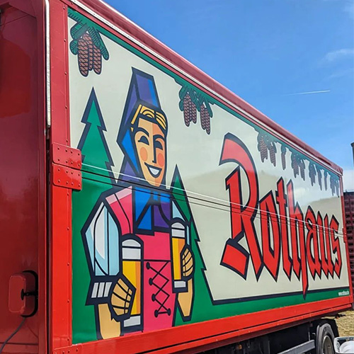
Most beers from that part of the world feature coats of arms or charming Bavarian architecture in a distinctive style that’s almost become visual shorthand for “this is from Germany.” Rothaus, on the other hand, sports a brazenly minimalist assemblage of sharply angled, brightly colored shapes. They come together to form a woman in a pink tunic standing next to some pinecones, holding two beers, and positively beaming at the viewer. Her fans — and there are plenty — have named her “Biergit Kraft,” a local play on words that translates to “beer gives you power.” For the first 16 years of her life, she shared the pastoral aesthetic of her fellow German brews. Then in 1972, the team at Rothaus decided to give her a cubist makeover, and aside from slight alterations to the tint here and there, they haven’t changed a single thing since.
Git Creative
Holler, who co-owns Brooklyn’s Black Forest along with his wife Ayana, was the first proprietor in America to serve Rothaus. His connection to the beer is fitting since both the Hollers and the brewery are native to the Baden-Württemberg area of Germany. The importance of Rothaus and its omnipresent mascot to the region is obvious from even a casual glance at the bar’s look and vibe — its logo is even based on Holler herself, mixed with Biergit.
“I think in the ’70s, this was actually a pretty progressive beer label,” Holler says when asked for his thoughts on the design and why it’s stuck around so long. He feels that the label helped Rothaus stand out a half century ago, “and then they never changed it.”

That first and only change came when the shop that printed the labels for Rothaus was running low and needed to make more. Rothaus planned to use that as an opportunity to refresh the look of its Tannenzäpfle Pils and the blonde who adorned the label. But the higher-ups at the brewery hadn’t found any designs they liked yet. The shopkeeper put them in touch with a local graphic designer named Roland Jenne, who at the time was living paycheck to paycheck, which makes what he did next a pretty bold move: He said he’d take a stab at designing a new label — and he had notes on the last one.
“The various labels they had, the coat of arms, antlers, and whatever else, I found that to be wrong for the product,” Jenne says in a video on Rothaus’s website that a friend was kind enough to translate. According to Jenne, he wanted something that would work in black and white as well as color, that centered around the pre-existing avatar of a woman in traditional Black Forest garb, and most of all, was distinctive.
“I didn’t want this photorealistic thing because it just wasn’t usable everywhere,” Jenne says. “For me it was very important to get significance, something that cannot be found on other products in this industry. I think through the white and black, these strong contrasts and the clear colors, we’ve achieved this.”
Git Famous
In recent decades, the modernist gal in a traditional outfit has developed something of a cult following. The brewery, which eventually put her on every single one of its beers, hosts a festival every year where fans dress up in Biergit costumes, complete with wooden masks. And when New York City brewers Interboro and Other Half collaborated on a German-style pilsner, they turned to her image for a hefty dose of inspiration.
Redesigning Biergit now would clearly be marketing suicide. But how did she stick around long enough to become so charmingly old-fashioned?
“There’s something about a mascot — and a poorly drawn one at that — it’s just always going to make people happy.”
For starters, Rothaus is one of only two state-owned breweries in Germany, the other being Weihenstephan, the single oldest brewery in the world. It’s understandable that significant changes would be few and far between when a company moves at the speed of bureaucracy (case in point: Rothaus never did get round to answering any of our questions for this story).
The Black Forest area is also often viewed within Germany as a place that’s slow to abandon old ways, sometimes to its detriment. British film producer Zander Sharp lived there for 18 months from 2020 to 2022 and says that the attitude is similar to New Yorkers who look down on the American South or the state of Ohio for being uncultured, adding “Baden-Württemberg is Ohio.”
But it feels like there’s something else at work here, too — a larger media strategy that could be summed up as “not really having a media strategy.”
Rothaus famously doesn’t advertise on TV or radio, something the brewery evidently takes great pride in, although it does sponsor a number of local sports clubs, including a handball league, which is frankly just adorable. The brand’s English website is a miasma of broken links and the official Instagram handle is 29 unbroken, uncapitalized, unpunctuated letters long. To the average American, that might look like a linguistic car accident, but in a highly unscientific poll of German speakers I conducted, it was usually described as “decipherable.” Add it all up and it starts to look like Rothaus’s answer to a world of market research and targeted ads is deeply charming indifference.
“There’s something about a mascot — and a poorly drawn one at that — it’s just always going to make people happy,” says Naglich.
Sharp agrees. “It’s hokey and sweet and has the energy of a simpler olden time. It’s like diners,” he says before adding, “Also she’s a slice without being Oktoberfest smutty.”
By all outward signs, it seems the smiling girl holding her beers next to her pinecones isn’t going anywhere. Rothaus did, in 2006, swap out Jenne’s ’70s label for the original, traditional version of Biergit Kraft for her 50th anniversary. But then, bowing to carefully surveyed customer data and analyses of larger macroeconomic trends — or maybe just the power of inertia — they quickly changed it back.