
Danielle Grinberg is VinePair’s art director. You can find her out and about looking for vintage coupe glasses, or drinking any cocktail with passion fruit in it (because why not?).
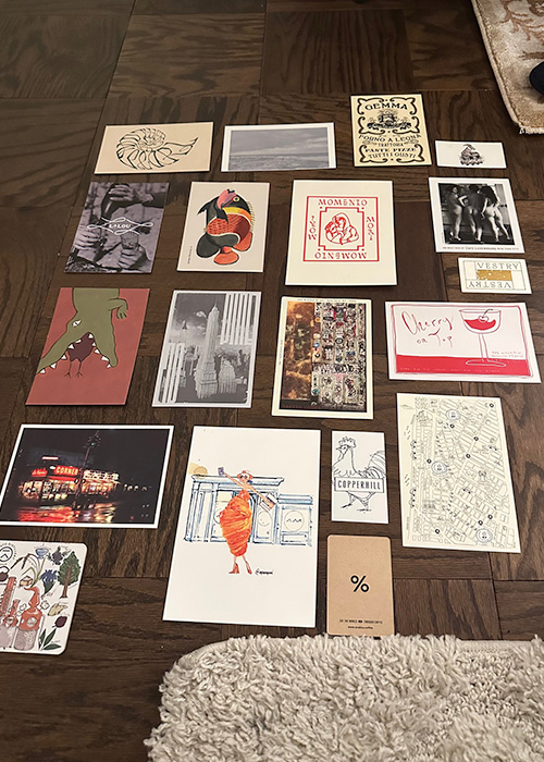
I’m sitting on the floor of my Brooklyn Heights studio apartment. The already-minor uncovered floor space now has little papers strewn across it — 5-by-7-inch cardstock, some coasters, and a few business cards in between. I keep rearranging them, removing one and adding another. I just can’t seem to get a layout that feels right. The open-mouthed crocodile doodled on the postcard from Le Crocodile — where my boyfriend booked a last-minute brunch date on a weekend in 2021 — meshes well with the typography on the postcard from Gemma, an Italian restaurant in the bottom of the Bowery Hotel where I met a friend for dinner back in 2019. I’ve been attempting to create a collage with all of the cards, but still, I haven’t even reached for the tape or glue stick. So back the postcards go, into the crinkled Ziploc bag (for the umpteenth time), until I’m ready to open it back up and slide in the newest addition.
Receiving the check at a restaurant isn’t typically the dining experience one is most eager for, yet I find my thoughts drifting to the bill as soon as the last bite of dessert is devoured. It’s not because I look forward to slapping down my credit card, but rather to see if the bill is paper-clipped to a piece of cardstock with a funky design and the restaurant’s name. I’ve spent the past five years reaching for these postcards as I’ve made my way around New York’s restaurant and bar scene — the same amount of time that I’ve been living in this city and experiencing culinary delights beyond Kraft Easy Mac in my college apartment.
To date, I’ve amassed nearly 100 of these mementos. I’m kicking myself for not writing the dates on the back of each one, but there’s still a general sense of when and from whom I snatched the check to make sure I was the one to pocket the coveted postcard.
I’ve dined with multiple people who reach for restaurant- and bar-branded matchbooks. But postcards? I don’t really know anyone else who cares for them. Maybe it’s just that my time as a creative in the drinks space has led to me developing a strong appreciation for the aesthetics and small takeaways when dining and drinking out.
After some searching, I was able to find a community of people who share my interest in these keepsakes — and where else but Reddit? The original post notes Jack’s Wife Freda and Dante have nice ones. I peer at my collection and pull out my own from the former, and I laugh, because it’s one of the first I collected and one of the last places I’d go to now. I’ve moved on from NYC chains like Jack’s Wife Freda and The Smith in my attempt to expand my culinary tastes and become a little less “basic” each and every day.
The rest of the thread, which seemed to be in its peak only three months ago, consists of postcard recommendations from myriad notable NYC spots like Tacombi, The Odeon, Minetta Tavern, Balthazar, Francie, and “basically every french restaurant.”
Of course, the art director in me can spend hours scrolling through illustrator portfolios — not only to commission for editorial art, but also to cultivate a sense of calm. Looking at pleasing visuals is good for the soul. In the same way that bars and restaurants utilize color theory to inform their interiors and even drinks, there has to be some explanation or process behind the artwork attached to an establishment’s detested check.
“Takeaways like postcards are great opportunities to inject some lasting brand personality at the end of the dining experience,” says Nick Johnson, creative director of branding studio All Good, who specializes in creating visual experiences and narratives for the food, beverage, and hospitality industries — including postcards. “This is especially true for restaurants that are a bit more reserved in visibly expressing their brand within the space. Leaving your guests with some distinctive graphic design, photography, or creative writing at the end of a meal can really tie things together. It’s a creative cherry on top of a good meal.”
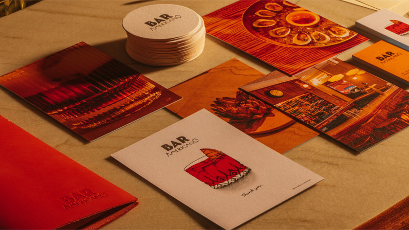
Johnson developed the creative for Bar Americano in Greenpoint, Brooklyn, a cocktail spot inspired by the famed aperitif bars of Spain and Northern Italy. “We wanted a takeaway postcard that would double as a check presenter, so we sourced card stock that was thick enough to act as a backboard and stand up to the elements when reused,” he says. “Our favorite of the illustrations we created for the branding, a detailed candy red Negroni, was a perfect fit for the front of the card, sandwiched between the Bar Americano logo above and Thank You written below. On the back, we used a series of vibrant photographs we’d taken of food and drink — a different one for each card. We liked the idea of presenting a bit of variety.”
Looking at my own collection, there’s certainly no shortage of design variety. An iconic photo of the Empire State Building overlaid with the narrow and stretched text of Crown Shy’s logo sits beside a colorful rainbow fish drawing, courtesy of Sunken Harbor Club.
“There’s four cards total, each with a different fish,” Hamish Smyth, partner at creative design studio Order, says of the latter. “It’s a long story, but the fish were taken from an old book illustrated by an 18th-century explorer who had traveled the world and returned to Europe with tales and memories of these exotic creatures. The only thing was, he made most of it up! Eccentricities like that fit in well with the lore around [Sunken Harbor Club] that St. John Frizzell and the team created.” It’s the little details and backstories like these that make these postcards so much more than a bill holder, but something with meaning.
A few below, striking red typography intersects with a drawing of a woman in a cloak, matching the minimalist branding of MADRE, a New American restaurant in Greenpoint. There are so many styles, from photography to risograph prints and illustrations.
Some of these postcards are from beloved spots that fell victim to the pandemic’s raid on cocktail joints. Small pieces of cardstock from Pouring Ribbons (RIP) and Coquille, a seafood spot in Vancouver (one of the first “adult” meals that I paid for in 2018 on a trip with my best friend) transport me to irreplaceable evenings spent sipping and laughing between bites. A decorative logo in the shape of a conch shell brings back memories of a fun night with my college friends at Mother of Pearl, a tiki bar and restaurant in the East Village that is no longer around today, but whose shark-shaped glassware was everywhere on Instagram in 2015.
I just did a deep clean of my apartment, every spec of dust vacuumed up, but I know that someday soon, I’ll open that Ziplock back up and my living room floor will once again be filled with a sea of mini memories. Perhaps I’ll commit one day to selecting 10 to 15 aesthetically pleasing postcards to collage together. More likely, though, they will end up back in the bag, waiting to be joined by new scraps — future reminders of who I once was.