Much has been said about the merits of alternative packaging for wine, from longer shelf lives to a lower carbon footprint. Yet getting a dedicated wine drinker to shift away from a bottle-centric mindset remains tough, in part because of the widely held conception that the wine itself must be inferior. But in the wake of a recent “VinePair Podcast” episode, another thought struck me: Could the actual look and design of the boxes be part of the problem?
After all, a boring label on a wine bottle might be a bit of an eyesore, but for the most part that bottle is either finished or dumped out within a couple of days of being opened. With boxed wine brands touting their long shelf life, would-be drinkers need to actually enjoy looking at the thing for days or even weeks, and to have the sight of it in the fridge or on their counter fill them with joy, not shame.
A box also presents unique challenges and opportunities for a designer. As everyone I spoke to for this piece was quick to point out, the six panels allow for vastly more real estate than even a large wine bottle, and while some of that space has to be devoted to meeting TTB requirements for alcohol labeling, that still leaves plenty of room for eye-catching design, all the more valuable at a time when standing out on social media is a must.
For Bota Box marketing director Nicole Lockwood, the box’s material is a huge part of the brand’s identity, which has always emphasized sustainability. “The paper we use for the box is post-consumer recyclable before we even print on it,” she says. “We use water-based inks that are better for the environment, and even for glue we use corn starch. All of these choices were made way back in 2003 to make sure that this brand lived up to the core concept of being sustainable.”
For brands that exist across multiple formats, or were first created as bottled wine, maintaining a consistent visual design across those packaging types is a massive consideration, like for Precept Wines creative director Amanda Rockwell. With the company’s most iconic offering, House Wine, the focus is on making sure that the bag-in-box affirms the strong existing brand identity, while for a newer line like Provisions Wine Co., the entire brand design was centered around a more “on-the-go” aesthetic.

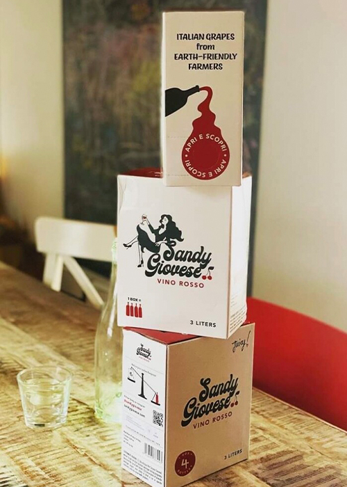
For Amy Ezrin, founder of Sandy Giovese (recently named VinePair’s top boxed wine brand), the box provided a creative journey for the consumer that a bottle couldn’t compete with. “It’s a billboard,” she says. “You have these panels that you can use to both catch someone’s eye and convey some simple and primary facts about the box and why it’s a great idea.” For Ezrin, that started with defining “Sandy,” her alter ego and the creative North Star for the entire project, then finding ways to highlight her on the package.
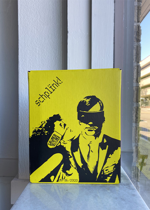
Where some of the newer and smaller producers tend to break from the established mold of boxed wine is in focusing less on the informational and educational components of design, and instead leaning into their visual appeal. Indeed, that’s what struck me about some of the boxed wines sold by Communal Brands, including the second-place wine on that same list, Schplink Grüner Veltliner, which comes in a bright yellow box with artistic images of people layered on. Melissa Saunders, MW, the CEO of Communal Brands, explains that creating packaging that defies what most people expect from boxed wine helps convince smaller stores to stock her wines in with other premium wines, instead of relegating them to a boxed-wine section, should they have one. For Schplink, it’s about creating a package that would never be confused for one of the legacy boxed-wine brands and, in fact, shares much more in common with natural wine or craft beer imagery.

It’s almost certainly true that the biggest barrier for boxed wine is the consumer stigma around the quality of the wine itself. Creative and thoughtful design might not be able to obviate that particular obstacle, but there’s no doubt that as boxed wine brands look to emphasize their greater levels of sustainability and practicality, a modern aesthetic can also go a long way toward making their packages an attractive purchase option in an ever-crowded marketplace.
This story is a part of VP Pro, our free platform and newsletter for drinks industry professionals, covering wine, beer, liquor, and beyond. Sign up for VP Pro now!
