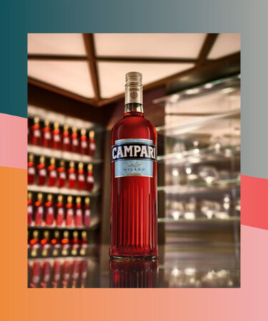
An iconic apéritif brand is taking their classic packaging in a new direction. Campari surprised Instagram users when it unveiled its new bottle design in a May 4 post.
“Since its creation, the Campari bottle has been changing shape and evolving alongside the city of Milano,” the brand explained in the caption. The sleek new design features vertical detailing in the glass along with a horizontal, baby blue label printed with bold font.
The brand also adds the new packaging specifically reflects the elegance of the apéritif’s home city.
“Today we introduce the redesigned Campari bottle — a visual homage to the city of Milano and a celebration of Milanese Aperitivo culture,” says the brand. Campari holds a long history in the region, as head of marketing Julka Villa shared with The Spirits Business in a recent interview.
“In fact, the vibrant iconic apéritif was first sold on draft in vats and served in decanters, before adding a brand label in 1888 and finally featuring the brand logo that is recognisable today in 1912,” she tells The Spirits Business.
For those who live under an apéritif-less rock, Campari is an Italian bitter liqueur with a distinctive red hue. Its flavor profile might be polarizing — think bitter and herbaceous — but it’s often a necessary ingredient in Negronis and endless spritzes.
This definitely calls for a round of Negroni Sbagliato.
