
In the past we’ve taken a few looks at the “where” of American wine and beer consumption. Those maps include:
· Where America’s 9000 wineries are located.
· The states with more wineries than breweries.
· How the demand for wine has grown in different states over the past two decades.
Yesterday the Washington Post’s Wonkblog published three interesting maps that take our state-by-state winery and brewery map to an incredibly local level. They asked the question, “Do you live in beer country or wine country?”
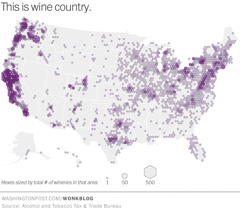
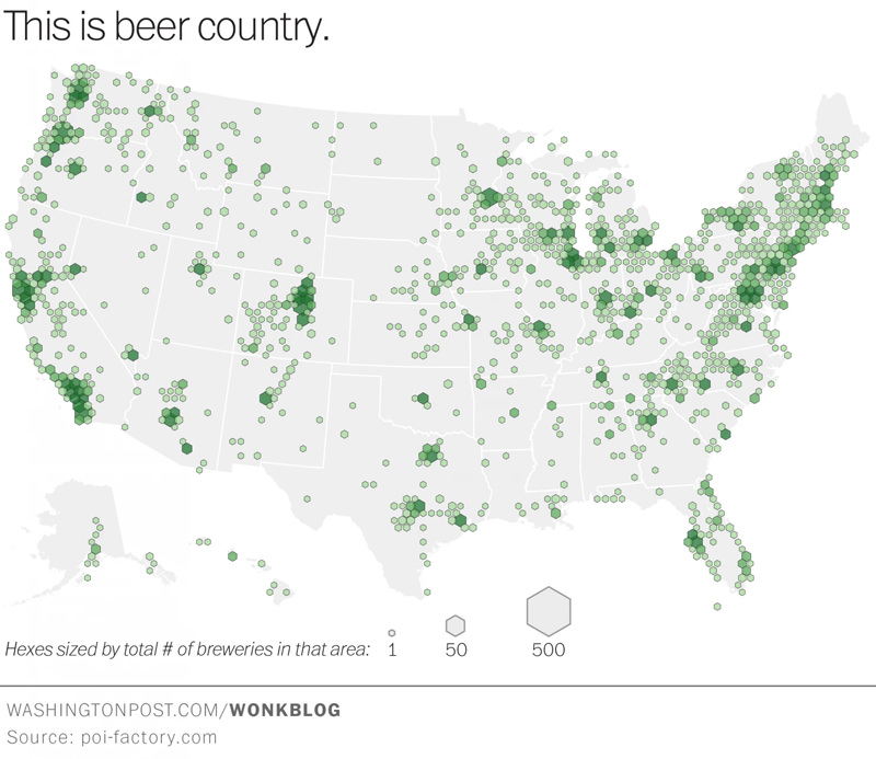
These three incredibly detailed maps are the answer:
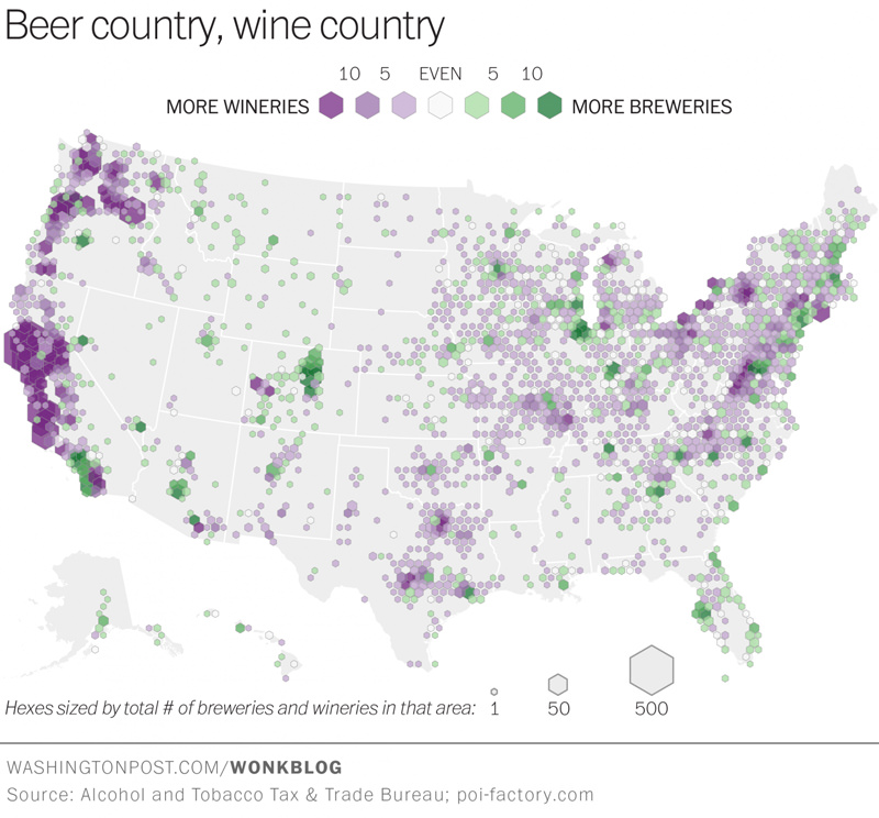
You can head over to Wonkblog to learn more about how they were able to map all this alcoholic info to such a local level, along with a ton of interesting insights like this one:
The West Coast jumps out immediately for the incredible concentration of winemakers there. The California coast is dominant, but Oregon and Washington stand out as well. Washington’s Cascade Valley is also hard to miss. On the other coast, Long Island, New York’s Finger Lakes region, and parts of Virginia are colored deep purple too.